Homage to the Rhode Island Coast

Fotographia is the current, completely online exhibition from the Emerge Gallery in Saugerties, and in my last post I promised that I’d tell you about the two photographs of mine that were chosen for it.

As the name implies, Fotographia features photographs exclusively. Fortunately for me (and for other adventurous creators of photographic art), gallery owner Robert Langdon encourages artists to stretch their boundaries, leave their comfort zones, jump out of the box, because many of my choice artworks aren’t instantly recognizable as photographs.

Take Windswept, for example. Windswept was the name of what had once been a twenty-one-room mansion on the New England coast—specifically, a short drive north of Narragansett, Rhode Island. This ruin is all that’s left of it today. Easily accessible from a trailhead that’s located right on the main road, Windswept (what’s left of it) has been photographed countless times, and so my challenge was to do something different with it. It looks quite striking when the sun is illuminating it from a bright blue sky—the gold-and-blue combination is always a powerful one. I had some images like that and experimented with various filters, such as making it look like something Turner would have painted. None of those really respected the character of the place, at least not to me. Finally I decided it was time to put the virtual paintbrushes away and try something more in the character of a drawing. Here you see the result. The stones are strongly outlined without having a gritty look (I didn’t want gritty), and the absence of the bright colors emphasizes the shapes and lines. Lesson learned: It wasn’t necessary to rely on the bright colors to portray this interesting historic structure effectively.

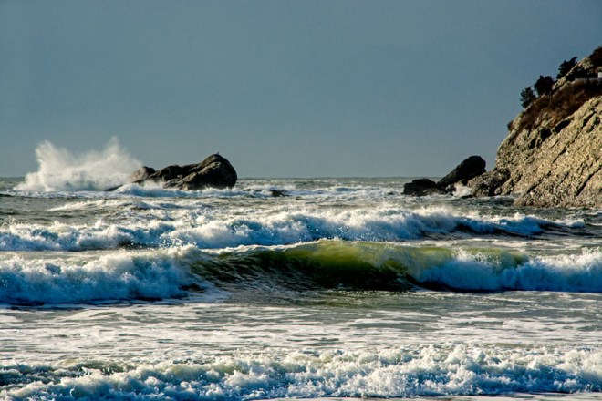
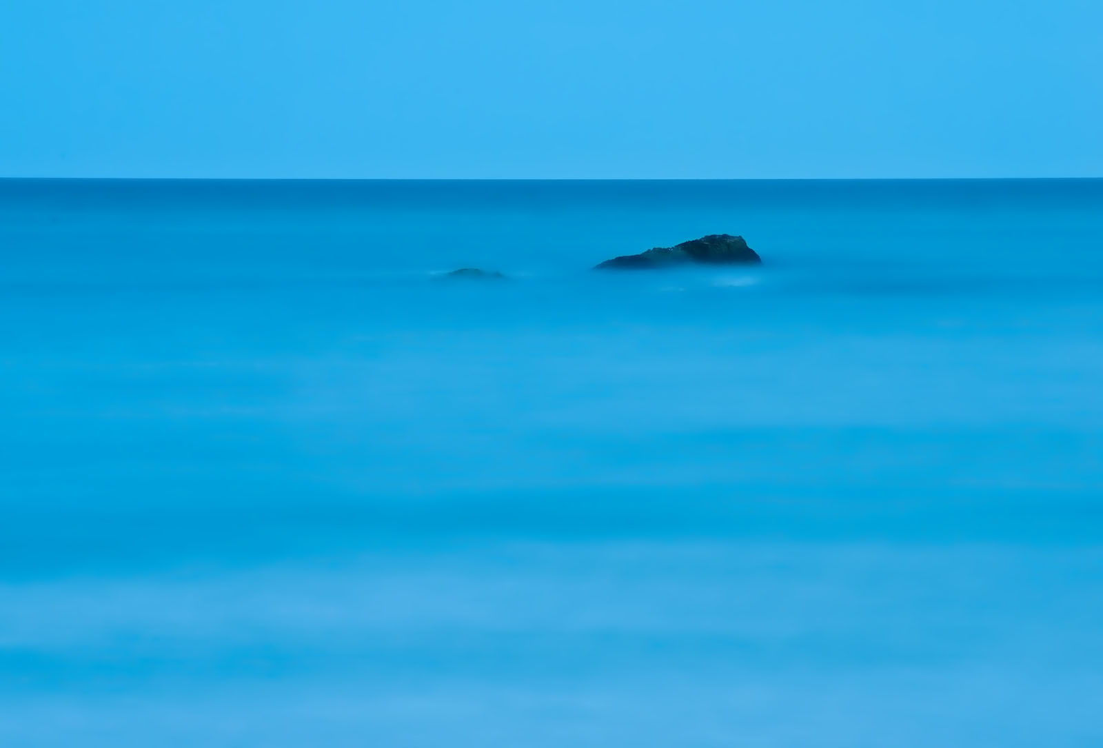
In the second half of the 19th century some of the artists who had been painting the Hudson Valley and Catskills started to travel east, following what would eventually become the New England coastal experience. They included John Frederick Kensett, William Trost Richards, and Alfred Thompson Bricher. I fell in love with this school of painting when I saw several examples in the windows of the William Vareika Fine Arts Gallery in Newport, RI. Early one morning—before opening hours—I was feasting my eyes and Mr. Vareika (one of the Nicest People in the World), who was waiting for art shippers to pick up a consignment, let me run upstairs to see an Alfred Bricher. I was hooked. Now when I photograph this section of the Rhode Island coast, I feel the spirits of the 19th-century artists who immortalized these scenes in their paintings. This work, which I call Timeless, is my most successful attempt (thus far) to pay homage to this typical way they had of catching the sweep of the coastline. By using a filter that flattens the details, I ended up removing, from the human figures, any suggestion of a particular point in time. My son said he could just imagine the Victorian people walking this beach. For me that meant success.

Fotographia will run online until May 30. You can visit it here. And of course, all artwork is for sale.

Something Blue

I love George Gershwin’s Rhapsody in Blue. And contemporary composer Michael Torke’s Bright Blue Music. And blue skies and blue water. When Robert Langdon of the Emerge Gallery in Saugerties issued a Call for Art for a show he was titling “Something Blue,” I did one of my “digital rummaging” exercises through my recent (two or three years) photographs for some works to submit.

It wasn’t as easy as I thought. Images for gallery shows have to be topnotch in their own right, and they have to have sales potential for the particular gallery you’re submitting to. Here I am submitting to a gallery in the Hudson Valley and most of my best “blue” pictures – again, think water and/or sky – are, well, taken in Rhode Island.

Fortunately, water and sky have a universal appeal that transcends their particular location. It’s not as if I were submitting pictures of buildings in Providence (I hardly have any). So I chose three, and these two were accepted.

Blue Paradise

One of my dear longtime mentors, California-based photographer Kerry Drager, always advises his students and followers that when they’re searching for a composition and find a nice horizontal, then turn the camera around and see if there’s also a good vertical to be had. (And vice versa.) The aptly named Blue Paradise (I love this place) is one of those experiments that didn’t quite work out. With tons of horizontal images in varying compositions already in my files, I wanted to try for a vertical, and the sky that evening seemed as if it would be perfect for this – nice layers of different colors. The problem was that I underestimated the strength of the top, white layer; it was overpowering. It had to go. The end result was what you see here – another horizontal, but one of my best of this scene. And I always like trying for an effect where the solid, unmoving rocks contrast with the silky texture of the water (longish exposure, facilitated by the diminishing daylight). Blue Paradise is hanging, matted and framed, in the Emerge Gallery’s “Something Blue” show.

Unconquered

Unconquered is one of those pictures that virtually took itself. When the wind gods favor me with the wild waves, I find a good composition and click the shutter again and again, because that’s the way you ensure you’ll get one good one out of the bunch. Ask Kerry, he does this on the West Coast. Here my unmoving, solid point was the lighthouse, which (thanks to the telephoto zoom) looks much closer than it is. In postprocessing I had to do some work with clarity and brightness to ensure that the light and the rocks would stand out. And then I wanted to give the picture a title that would draw attention to the lighthouse and not to the obvious drama in the waves. My friend and fellow Catskills photographer John O’Grady often likes to do that – title a photograph after a very small object in the image – and sometimes I find myself channeling John when I’m photographing. What to call a picture about a lighthouse sturdily surviving being battered and buffeted by the wild winds? As I was thinking about this, I had the radio tuned to our classical music radio station, WMHT, and the music being played was my favorite piece by the above-mentioned Michael Torke: Unconquered. I had my title.

“Something Blue” runs in the actual gallery until April 25, but the pictures will still be available to purchase online from Emerge’s Artsy site after that – my Unconquered and lots of other fabulous works by my fellow artists are in the “online only” show. Please, if you’re local, visit the gallery, otherwise welcome online!

Repeat Visits Pay Off in Photography

DSC0352 Top Adj s

Photographers who teach and write will often tout the benefits of returning to a spot again and again. It pays to get to know a place well. The season of the year, time of day, weather, light — there’s a whole host of factors that, in an almost unlimited number of combinations, will pretty well guarantee that the spot will never look exactly the same twice. Add to that such factors that are more under your control — your vantage point, lens, focal length, exposure, etc. — and if you’ve found a place you like, it can be a virtual goldmine of different images for you.

I’m going to illustrate this for you with examples of images I’ve made from one of my favorite spots over the years: Second Beach in Middletown, Rhode Island. Water, sand, rocks, light, people — all these and more go into ensuring an endless variety of photo opps.

DSC-3345 Nik ConColRnge s

The rock with the wave breaking against it is for me one of the main visual attractions on Second Beach. Rhode Island’s coast is often windy and it didn’t disappoint on this January morning. It’s a matter of taking several shots, trying to anticipate what an approaching wave is going to do, and hoping you got a couple of good images out of the perhaps dozens you took. Tip for wave photography: Be sure your Exposure Delay Mode is turned off!

DSC0341 2 s

Here’s a complete contrast. The tide is in and the water is calm. I made these images in the evening in order to be able to get the long exposures needed to get that ethereal look in the water.

DSC0316 s

This features a close-up of the piece of rocky coast that’s on the right of the first image. I deliberately heightened the contrast between light and shadow in order to make the most of the morning sun highlighting the people.

DSC0327 ed s FL

When the waves are up, this is a popular spot for surfing, including surfing on these stand-up boards, which attracts all ages. Here I’ve turned slightly to the left to make the most of the golden early morning light. In the background is the silhouette of Sachuest National Wildlife Refuge, a favorite site for photographers and birders alike.

DSC0381 Topaz photo pop - s

Again looking left, this time a wide-angle view featuring clouds and reflections toward the evening.

DSC0570 cr s

Finally, a classic example of “Don’t forget to look behind you”: the spires of St. George’s School against a red setting sun.

Another featured attraction close by is the famous rock where Bishop Berkeley used to sit, ponder, and write. It was Bishop Berkeley who posed the question, “If a tree falls in the forest and there’s no one there to hear it, does it still make a noise?” Berkeley’s rock is a photo opp all in itself.

Black and White Photo Challenge

Fellow photoblogger Janice Sullivan nominated me for the 5-day Black and White Photo Challenge. It had been a while since I’d done any serious B&W conversions so I was glad to have this discipline. Below are the photos, with something about each one. Each image was originally posted on my Facebook page.

Ed IMG_1190 Nik Neutral sThis is the interior of The Coffee Pot in Littleton, NH; the old-fashioned interior lends itself well to B&W. I had already processed this in color and chose to make the B&W conversion from the psd file instead of from the jpg to which I had added some Topaz Adjust finishing touches. This conversion was made with Nik Silver Efex Pro 2, in which I used the Neutral preset and simply increased the structure a bit as I like the somewhat gritty look that gives.
OLYMPUS DIGITAL CAMERAIf you know my image Dreamtime at the Ashokan Reservoir, this is another taken on the same day. After preliminary processing in Lightroom 5, I brought it into Photoshop and added a B&W layer, decreased the Cyans and Blues to darken the clouds (and their reflections in the water), and increased the Yellows and Greens to lighten the bridge structure to make it more prominent. I also cropped it a bit from the bottom; without the “dreamy” look of the color image I wanted the bridge to stand out more.


DSC-3000 BW s

This was taken at the Sachuest National Wildlife Refuge, Middletown, RI, when sun and wind combined for the right conditions early one morning. Observing the waves and trying to capture “the decisive moment” is a meditative experience. Here I was struck not only by the wave action but also by the play of the rising sun on the edges of the rocks. B&W conversion was simply a B&W layer in Photoshop CS5. I darkened the Cyans and Blues at the top of the image to make the contrast with the wave stand out more.


DSC-0338 BW s

This image of a barn and tree in the Adirondacks first went into Lightroom to increase clarity to enhance detail in the barn and the grass. Then I brought it into Photoshop for B&W conversion by adding a B&W layer. I tweaked the Blues to darken the sky but not too dark, then increased the Greens to bring out more detail in the grass.


DSC 2 -2619 BW s

Finally, here is the Diana’s Bath waterfall in New Hampshire. I began by working on my processed jpg, but then decided to take the psd file back into Lightroom to increase the Clarity. That worked! Then back into Photoshop where I added a B&W layer, then tweaked the Shadows/Highlights a bit. In the process, I ended up with a better color version as well.

What do you think? Let me hear from you. If you’re interested in purchasing a print as a gift for yourself or a friend, click on the photo to go through to my FAA website. Thank you for looking.

Postprocessing Those Historic Buildings: A Lesson Learned

BL DSC-1707 Top Hvy pop grunge

Recently I posted about my experiences in shooting and postprocessing images of some historic buildings in Rhode Island, choosing images of two different sites for examples. One building, the Bradford Soap Factory, is still in use for its original purpose; the other, the Royal Mills, has been converted from its previous industrial use to a block of residential apartments. What they have in common, however, is that both are in essentially urban settings and are still in use. This enabled me to be quite consistent in my postprocessing; in each case it was the same preset in Topaz Adjust 5 and Nik Silver Efex Pro 2 that I could use with effect for color and monochrome versions respectively.

That changed when I went to process two other sets of images. One was from the same Rhode Island shoot — the “decrepit” (to use the Providence Journal‘s word) Hope Mill in Scituate — and the other from one of my frequent and recent trips to the Northern Catskills, home of many hotels and resorts that went bust — this time a resort called Villa Maria that occupies an extensive property in Haines Falls. These two sites also have two things in common: they’re not in urban settings and they’ve not been kept up. This means an awful lot of overgrowth with grass, greenery, and, in the case of the Haines Falls site, plenty of goldenrod.

BL DSC -1710 Top Hvy Pop SmoothSo, when I tried to process the Hope Mill images, I quickly realized that the same Topaz Adjust preset wasn’t going to work for the color: the greenery — and there was plenty of it — was undersaturated and the results were rather lifeless. I used different presets (again in Topaz Adjust) that worked for the Hope Mill images, and for the monochrome could continue with the same preset in Nik Silver Efex Pro 2. The one at the top of this post was done with Heavy Pop Grunge; the greenery isn’t that overwhelming and the preset brings out the detail in the building nicely.  For the image at the left, however, it had to be Heavy Pop Smooth — thus, similar but without the level of detail that would have caused the greenery to overwhelm the building. In both cases, the Heavy Pop brightened up the grass and the sky.

Villa Maria was a different story. For one thing, this isn’t one building but a variety of buildings. Also, there was quite a bit more overgrowth. Here’s the problem: I often like to show a lot of detail — structure — in these photographs, on the buildings themselves. But use a high-structure preset where there’s lots of grass and weeds overgrowth and the pictures looks too messy, too busy.

What to do? Basically, I separated these images into two types — the ones in which the building prevailed and those in which the overgrowth prevailed — and processed accordingly, again using Topaz Adjust presets (as yet I haven’t processed these in monochrome). Here are some results. Oh, and before I forget: This post could end up being another in my “Do It Now” series: My friend Bill Patenaude sent me an article from the Providence Journal reporting on a Connecticut developer who wants to take over the Hope Mill and give it a similar sort of treatment to the Royal Mills. And I understand (this is anecdotal from someone local in Haines Falls, I have no written source) that someone has bought the Villa Maria site. So, photograph these places while you have the chance … you never know when they’ll change, or even disappear.

Close-up of bjuilding. minimal greenery, thus a more detailed treatment was possible.

Close-up of building. minimal greenery, thus a more detailed treatment was possible.

In a sense, this image breaks the rules I've just established. The grass, weeds, and trees really are the main subject, more than the building, so I let in some detail to highlight this.

In a sense, this image breaks the rules I’ve just established. The grass, weeds, and trees really are the main subject, more than the building, so I let in some detail to highlight this.

Villa Maria. Too much detail in all that shruibbery would have overwhelmed the building. I went with a somewhat softer look in which the color prevails. This somehow shows a harmony between the building and the green.

Villa Maria. Too much detail in all that shrubbery would have overwhelmed the building. I went with a somewhat softer look in which the color prevails. This somehow shows a harmony between the building and the green.

Recording Rhode Island’s Industrial History

My friend Bill Patenaude is the Chief Environmental Engineer for the State of Rhode Island and a prolific and challenging blogger on environmental issues and ecotheology. He’s also a lifelong resident of an area of the state that’s rich in industrial history and has the buildings to prove it. Some of those buildings are still used for their original purposes; others have been creatively repurposed; and others are, alas, in ruins. In June Bill took me on a tour of this area, and after a summer of preparing for my exhibits, talks, etc. I’m finally getting back to what I love best next to the photography itself: postprocessing the “keepers.”

Thus far I’ve produced a total of six postprocessed images from our June tour: three original images, each of which I’ve processed in two ways, all using Nik software: first, the Bleach Bypass preset in Nik Color Efex Pro, which I find interesting for the way the saturation can be creatively tweaked; and then the Wet Rocks preset in Nik Silver Efex Pro 2, to which, in each case, I added just a hint of tint.  (As you can see, I was going for some consistency here.)

Our first stop was the Original Bradford Soap Works in West Warwick. Bradford was founded in 1876 and named after Bradford, England, which was the center of the textile industry there just as Rhode Island was in the New World. The company moved to its present premises in West Warwick in 1931. I’ve processed two of my photos of  the Bradford Soap Works, and here I’m showing you the two versions of one of them.

Bradford Soap Works - Bleach Bypass processing

Bradford Soap Works – Bleach Bypass processing


Bradford Soap Works - Silver Efex Pro

Bradford Soap Works – Silver Efex Pro


The Royal Mills is the site of a historic textile mill on the banks of the Pawtuxet River. While textile manufacturing here goes back to 1809. the present structure dates from 1921. When the textile industry suffered, the site was virtually abandoned until it was taken over in 2004 and converted to an apartment rental complex. In that same year Royal Mills was added to the U.S. National Register of Historic Places.

Here is the one photo of the Royal Mills I’ve processed thus far, again in its two versions.

Royal Mills - Bleach Bypass Processing

Royal Mills – Bleach Bypass Processing

Royal Mills - Silver Efex Pro 2

Royal Mills – Silver Efex Pro 2


Now here’s where I invite you to participate: For each of the two pairs of images, which version do you prefer? (If you prefer a different version for each of the pairs, that’s OK.)  Please state your preference(s) in a Comment. And now for the prize: If I get at least five replies, those who commented will be entered in a drawing to receive a 5 x 7 print of one of these images — the image of their choice. I will choose not one but two winners at random. Your replies will help me decide which of the images to offer for sale on my website. You must reply by September 15. I thank you in advance!

_____________________________

 You are invited to my exhibition — “Natural and Historical Landscapes” — at the Cottage Place Gallery, 113 Cottage Place, Ridgewood, New Jersey. The reception is on Sunday September 14 from 2 to 5 pm.  Hope to see you there, if you’re in the neighborhood!


Recovering My Nautical Roots

In our home town we say, “I have Long Beach sand in my shoes”—in other words, you can move many miles away from your nautical beginnings (as I did), but figuratively speaking that sand will remain in your shoes, and the salt water in your blood.

Those of you who know my work know that I photograph frequently in Rhode Island, where the lure of historic buildings and quaint towns joins the Ocean State’s beautiful, windy coast to ensure that photographic subjects are never lacking. But for a serious recovery of my nautical roots I recently chose Cape Ann, on the North Shore of Massachusetts, because a friend once gave me a collection of card-sized prints of paintings by Edward Hopper for my birthday, and I treasure these as inspirations for what can result when Art and The Nautical meet.

Rockport was my base, where I stayed at the wonderful Eagle House Motel – within easy walking distance to just about everything in this delightfully charming village.

Over the next few blog posts I’ll be presenting some of my photos of Rockport and Gloucester and telling you something about these history-drenched places. I’ll be including Portsmouth, New Hampshire because the proximity of the Granite State’s only coastal city made it irresistible. But let’s start, appropriately, with Rockport and with Motif No. 1.

In the late 17th century two things drew people to Rockport—fishing and timber. In the 18th century came the quarries—more about that in a future post. Like much of New England—again one thinks of Rhode Island’s Aquidneck Island, with its beaches in Newport and what is now Middletown—Cape Ann, including Rockport, attracted many artists beginning in the 19th century. One of the favorite subjects of the artists who flocked to Rockport was a fishing shack located on Bradley’s Wharf in the Bearskin Neck section of the village. The fishing shack was built in the 1840s, and its red color, position on the wharf, and the way the light strikes it at certain times of day made it a “must” for the painters, and later, as well, for photographers. It was likely the artist Lester Hornby who first called it “Motif No. 1,” referring to its probable identity as “the most painted building in America.

So beloved is Motif No. 1 that when it was destroyed by the Blizzard of 1978, it was promptly—very promptly rebuilt. Rockport even celebrates an annual “Motif No. 1 Day,” which this year happened, coincidentally, to be yesterday, May 17.

I arrived in Rockport knowing only that I wanted to photograph nautical subjects. Boats, beaches, reflections in water, maybe a lighthouse or two. I knew nothing of Motif No. 1. But when I ventured onto Bradley’s Wharf  and saw this red nautically themed building during my initial exploration of Rockport, I knew I had to photograph it. Here are a few of my “finished” products.

DSC 0073 Wmth Bril - bl


The light was perfect and the reflections and sky worked. If you want to see a version partially processed in B&W, check this out.

DSC--0211 bl


My friends in the New England Photography Guild were discussing whether it’s possible to find a new way to photograph something that’s been done 12 million times. I don’t know, but here is my attempt:

DSC--0076 bl

Thank you for looking! More on other parts of beautiful Rockport later.

Favorite Photos of 2012

I’ve just compiled a list of my twelve–that’s right, an even dozen–favorite images that I made during 2012. Can I say they’re by far the best? Well, that’s always very subjective, and a photographer isn’t always the best judge of her/his own work. But IMHO they are certainly among the best, and I’ve chosen them to include representative images from my favorite places and subjects.

Here I’m posting a sample for you to see. Click on any of them, or on this link, to go to my website to view this entire gallery of twelve images. The entire gallery–each of the twelve images–is my Print of the Month for January 2013. That means not one but twelve pictures offered for purchase at the special Print of the Month prices. That’s my New Year’s gift to all my friends and followers. May you have a happy, healthy, and prosperous New Year!

C DSC0031 s DSC0007 s DSC0024 BW2 crop s DSC0280 s - Whisperly

Converting One of My Favorite Photos

One of my most popular photos (as well as one of my own personal favorites) is this one of a colorful street in Providence, Rhode Island. It’s just across the street from a historic Baptist church. I think the vivid colors combine with the downward slope to create interest and dynamism. Someone once criticized the fact that there were people in the photo but hey, you know what? Providence isn’t a ghost town! It’s a state capital! People live there! I did desaturate the man’s shirt somewhat so that the bright red wouldn’t draw unnecessary attention to him, but removing the people seemed an unnecessarily pedantic move.

As I said, the colors are obviously one of the image’s strongest features. And yet, because of my ongoing “Rhode Island in Black and White” project, I wondered how such a monochrome version would look. Maybe the variety of shapes and designs would enable it to succeed.

I tried four different versions, all with Nik Silver Efex Pro 2: three straightforward B&W and one sepia, since I definitely wanted a sepia in the mix. The three B&W versions all turned out to look remarkably alike–which, I think, shows that I had a certain vision for the image and ended up achieving it in three different ways. The one I’ve chosen is the one below, because it showed the most detail at one critical point. This was with the Fine Art preset, with Brightness, Contrast, and Structure adjusted to 0, 24, and 65 respectively.

For the sepia version I went with Soft Sepia, again with the Nik software. Here I adjusted the settings to Brightness 0, Contrast -23, and Structure 56. Note that the default Structure setting for this preset is -35, so that’s quite an adjustment. The rationale: If you dial down such an important feature as the color in this image, you have to make the best use of the other characteristics; the “softness” of Soft Sepia wouldn’t work, and I had to maintain the structural details–the lines, patterns, designs. Here is the result. What do you think?