Portrait of Susan

I don’t consider myself a portrait photographer by any means, but having learned about available-light portraiture from the wonderful Ibarionex Perello I at least developed enough confidence to shoot some portraits under those conditions. (I admire the people who work with strobes and all that sort of thing, but it’s beyond the tasks I’ve set out for myself in this lifetime.)

DSC_0197 1 sJust after I completed the course with Ibarionex, my friend, author Susan Heyboer O’Keefe, took me to dinner and asked me to shoot her portrait as her publicity mug for her upcoming novel. Susan is primarily known as an author for children and young adults, and Frankenstein’s Monster was going to be her first novel for adults.  Well, I said, I’d give it a try. Here is the result. Susan had a gift for the jaunty wearing of hats. I photographed her outside our office building, where the blurred reflection of fall foliage in the black glass provided an uncluttered background, and the light overcast sky that day was just what we needed to avoid harsh glare.

Last spring, when one of her brothers-in-law was Ed IMG_1369 sgetting married, Susan decided to get a blue streak in her hair for the occasion, and she asked me to photograph her. Not so much a formal portrait as a decent record shot. Here is one of them. The light was perhaps a bit too strong, but there was the advantage of the background being almost completely dark. Or so I thought. This turned out to be the only usable photo of the series, because for the others I turned in a slightly different direction — and ended up with a lovely tree reflection growing out of her head. Lesson learned: When shooting in the sun and you think your background is complete (or nearly complete) shadow, don’t assume anything: Check your LCD screen very carefully, preferably with a loupe, just to make quite sure.

Shortly before the blue hair incident, Susan had taken a bad fall on some ice outside her front door and used a cane ever after that. But not an ordinary, functional-looking cane. Not Susan. It was a consummately stylish cane, and she used it with aplomb, especially when it was accompanied by her usual array of colorful, flowing scarves and shawls. I regret that I never got round to photographing her with it.

The blue hair pictures may have been the last “serious” portraits ever taken of Susan. She died, suddenly and shockingly, of a suspected coronary embolism, two days before Christmas. She was one of the most enthusiastic supporters of my photography. She even gave a metallic print of my Vintage Chevy abstract to her brother-in-law as a present, at the same time as she ordered an aluminum print of it for herself.

But more than that: After her funeral in New Jersey yesterday, I decided to avoid the Interstates and instead return north via the back roads through Ringwood — that intriguingly liminal area where Passaic County melts into New York’s Orange County and where my cameras and I spent considerable amounts of time during the four years I lived in Bergen County. And along Route 511 I passed the Ringwood Diner, where Susan and I once met for Sunday brunch after I had finished shooting at Ringwood Manor (“Just call me when you’re finished,” she had said). Arriving first, I took up a table by a window and before long saw Susan coming up the ramp, smiling. Someone was smiling because they were about to spend time with me. It doesn’t get better than that.

Rest in peace, Susan. No, despite what the song says, you didn’t leave us laughing when you went — you left us crying. But undoubtedly you now have the folks in heaven shedding tears of laughter.

Note to self: Got to get back to photograph the Ringwood Diner.

Photographing Trees

DSC0184 Top s

It’s not often that a homily preached in church will serve as inspiration for photographs  (much less a blog post about photography), but then Fr. Michael Keane, pastor of St. Anastasia Church in Harriman, NY, isn’t your ordinary priest. He’s dynamic, inspirational, and the sort of guy that bishops everywhere would undoubtedly like to clone, several times over. Last Saturday morning I attended the All Souls Day Mass, and contrary to what one might expect — comparing “dying” nature to the departed souls — Fr. Mike regarded the beauty of the natural world as we’re privileged to enjoy it in the Northeastern USA in the autumn and compared our stunning fall foliage with senior citizens who’ve spent their lives serving and doing good. For trees and for the people, Fr. Mike said, it’s a time of transition, and that’s what he emphasized — transition, not dying.

The metaphor of trees was high on my mind because the previous week I had been privileged to meet renowned photographer Sean Kernan, one of whose major projects is Among Trees. You may have seen the calendars based on this theme with his photos over the past few years, or you can check out that project on Sean’s website or grab a copy of his book by the same name.

With foliage season having just about passed, I had some new images of trees in my own collection as well as some previous images that I now was inspired to process (or, in some cases, to reprocess). Here are a few previews; you can check out my entire (thus far!) Trees Gallery on my Zenfolio site. Hope you enjoy them! If you’re looking for a special gift for someone, all images are available for purchase.

DSC0226 s

DSC0261 s

PhotoPlus 2013 Takes Over the Javits Center

IMG_1705 sAnother huge PhotoPlus Expo has come and gone at New York’s Javits Center. I attended yesterday (Friday) so that I could also swing over to Grand Central Station to check out the Scenic Hudson exhibit, which was there for the one day only. This also made it possible to visit the B&H and Adorama booths, which are closed on Saturdays for religious reasons. I didn’t attend any presentations or workshops but did manage to get a look-in at virtually every booth, including handling the Nikon D7100 and the latest in the Lumix G series, the DMC-GX7KS. Lovely cameras both!

Here are some photos from the day.

Proudly showing the Nikon colors

Proudly showing the Nikon colors

Nikon always has an interesting set-up for people to practice their skills on. I liked this retro look--it fits right in with my obsession for photographing interiors of vintage diners.

Nikon always has an interesting set-up for people to practice their skills on. I liked this retro look–it fits right in with my obsession for photographing interiors of vintage diners.

At the AdoramaPix booth you could spin the Wheel of Fortune and win a prize. I won a coupon for an 8 x 10 aluminyzed print!

At the AdoramaPix booth you could spin the Wheel of Fortune and win a prize. I won a coupon for an 8 x 10 aluminyzed print!


Leaving Well Enough Alone in Photography

DSC0670 blog

Sometimes the problem with having an array of editing software and plug-ins on one’s computer is that one can fall into the trap of thinking that one has to use it. Don’t get me wrong–I love my Photoshop, Nik software, Topaz Adjust and all, but the danger of overprocessing is always present; these toys are always screaming out to be used!

Here are two photos I made on my latest visit to the Adirondacks, just after Thanksgiving. It’s of the High Peaks from one of my favorite vantage points, where the Adirondak Loj Road intersects with Route 73. I always shoot in Raw and jpg, and when I uploaded and looked at these particular images in jpg, I loved them just as they came “out of the box.” OK, possibly I cropped the bottoms slightly, but otherwise my first reaction was that they looked just as Asher B. Durand would have painted the scene.

I opened the Raw file of one of the images to try to process it but gave it up as unnecessary–why “improve” on what I already liked as it was? Am I concerned that people won’t think me sufficiently “professional” if I can’t offer an impressive description of my postprocessing?

Interestingly, I included one of these images on one of my 2013 calendars with the theme A Certain Beauty (thank you to the friend who suggested this theme), and when a lady who had bought one of the calendars leafed through it and came to this picture, she commented, “It looks just like an oil painting.”

DSC0679 blog

The Adirondacks: Visiting an Old Friend

DSC0639 s

The Lake Placid region of the Adirondacks has always been one of my favorite places to photograph. In a sense it was the place where I cut my teeth photographically, as many of my earliest serious endeavors took place there, back in the days of Fuji Velvia film and my dear old Nikon 6006 camera. My last visit there, however, had been a foliage trip in October 2010, and so it was more than time for a return. Thanksgiving weekend I took to the roads, fully expecting to get some gorgeous shots of the High Peaks in the sweet early morning sunlight–so lovely at this time of year when one doesn’t have to get up and out at an ungodly hour to make such images!

The weather had other ideas. The flurries I encountered on the Northway north of Schroon Lake–it’s always fun to drive through flurries, and they weren’t supposed to amount to anything–turned into some serious stuff by the time I was halfway between Exit 30 and Lake Placid on Route 73, and it became obvious that this wasn’t going to go away. Scratch the sweet sunlight shots; this was going to be snow close-ups in the Wilmington Wild Forest. Which I did. But after a lunchtime break at High Falls Gorge (more on that another time), as I was driving back toward Lake Placid along Route 86 (one of my favorite roads in the universe), the sun did make an appearance, just as i decided to pull into the parking area at Monument Falls.

Monument Falls is one of those iconic spots with a great view of Whiteface Mountain. I had photographed it countless times before, but years pass, you learn more about your craft, and you have a better camera and considerably expanded knowledge of post-processing, so I wanted to give it a try. In place of the late autumn foliage I had originally expected, there was, of course, snow, and the late afternoon sun was lending a nice glow to Whiteface. Out came the Nikon D90 and tripod, and I made several images, vertical as well as horizontal. I was more aware of the extra interest added by the mountain’s reflection in the water (the Ausable River, a branch of which runs through here).

Then came the post-processing. I worked on a horizontal that I thought was OK but decided to try a vertical as well in order to minimize the dark clump of trees that otherwise can threaten to be a distraction. When post-processing my historic or dilapidated buildings or my street scenes I like to give my creativity fairly free range, but my nature images I prefer minimal post-processing, on the theory that nature itself does it best. Still, I brought the image into Nik Color Efex Pro 4 (yes! I just upgraded to Pro 4). For some reason I decided to experiment with the Tonal Contrast preset, which I normally avoid in my nature shots out of concern that the result will look too artificial. Lo and behold, it worked. I moved the sliders to 44 (highlights), 50 (midtones), 20 (shadows), and 20 (saturation), and it was just enough to produce a “pop” without resulting in an inappropriate, contrived look. The result is what you see above.

Ed IMG_0350 sThis was also my first visit to Lake Placid since I got seriously into my street scenes and window reflections photography. Here I used my brand new Canon Powershot G15. Below is one of the results. Click on the image and it will take you to other images from this trip, just uploaded onto my website.

Memories of Staten Island

Having spent many happy hours between 2006 and 2009 visiting and photographing Staten Island, I was devastated to read about and see the photographs of the unbelievable damage that the island sustained during Hurricane Sandy earlier this week. At times like this photography is therapeutic for me, and so I went through my files and revisited all my photos of Staten Island. Even at the best of times this can be an interesting and productive thing to do, since it may well unearth photos you’ve forgotten about and never post-processed or, in this case, it helped me to rediscover photos I did post-process, but with the skills (and software) I’ve acquired in the intervening years I could improve my work on them.

I selected eight photos taken at different times over those three years, and at some point I may well go back and select more, not to mention process a few from the boat tour our Camera Club did back in the spring. Here I’m going to show you three of the eight photos and explain briefly what I’ve done in my latest post-processing round. To view all eight photos, please visit the special Staten Island Gallery I’ve created on my Zenfolio website. I’m designating all eight photos my Prints of the Month for November, which means that until the end of this month there are special sale prices on these photos. All the proceeds from sales of these photos will go to hurricane relief for the suffering victims of Hurricane Sandy on Staten Island, so please, if you’re thinking of doing some early Christmas/holiday shopping or even want to buy something for yourself, consider ordering one of my Staten Island photos.

Now, here we go:

The bright orange ferries stand out so well against the prevailing blues and grays of the water, sky, and buildings. It was a somewhat hazy day, and I just needed to intensify the colors a bit, which I did using a Levels adjustment layer. I also cropped out a bit of the sky at the top to ensure that the ferry and buildings didn’t get lost in the overall picture.

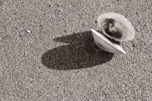
This was the first time any of these photos had had my black-and-white treatment; I wasn’t into it in those days. This lone clamshell on the sand just needed a B&W adjustment layer in Photoshop, and I chose the blue filter, which made the photo a bit darker, thereby highlighting the texture of the sand. The slight tint gives it a softer and yet somewhat more “natural” look.

The sand dunes at the Gateway National Recreation Area seemed a perfect candidate for black and white. Here I used Nik Silver Efex Pro 2 and went with the first Push Process preset.

What, no photos of the iconic Verrazano Bridge? Yes, there are two of them, along with a couple of nature photos that you’ll be surprised were taken within New York City’s borders, in the Staten Island Gallery on my website. And one of my earliest successful examples of what has since become a significant, recurring  theme for me–a historic building that played a role in the American Revolution. I look forward to your visit!

Converting One of My Favorite Photos

One of my most popular photos (as well as one of my own personal favorites) is this one of a colorful street in Providence, Rhode Island. It’s just across the street from a historic Baptist church. I think the vivid colors combine with the downward slope to create interest and dynamism. Someone once criticized the fact that there were people in the photo but hey, you know what? Providence isn’t a ghost town! It’s a state capital! People live there! I did desaturate the man’s shirt somewhat so that the bright red wouldn’t draw unnecessary attention to him, but removing the people seemed an unnecessarily pedantic move.

As I said, the colors are obviously one of the image’s strongest features. And yet, because of my ongoing “Rhode Island in Black and White” project, I wondered how such a monochrome version would look. Maybe the variety of shapes and designs would enable it to succeed.

I tried four different versions, all with Nik Silver Efex Pro 2: three straightforward B&W and one sepia, since I definitely wanted a sepia in the mix. The three B&W versions all turned out to look remarkably alike–which, I think, shows that I had a certain vision for the image and ended up achieving it in three different ways. The one I’ve chosen is the one below, because it showed the most detail at one critical point. This was with the Fine Art preset, with Brightness, Contrast, and Structure adjusted to 0, 24, and 65 respectively.

For the sepia version I went with Soft Sepia, again with the Nik software. Here I adjusted the settings to Brightness 0, Contrast -23, and Structure 56. Note that the default Structure setting for this preset is -35, so that’s quite an adjustment. The rationale: If you dial down such an important feature as the color in this image, you have to make the best use of the other characteristics; the “softness” of Soft Sepia wouldn’t work, and I had to maintain the structural details–the lines, patterns, designs. Here is the result. What do you think?

A Photogenic Diner

Diners are fun to photograph. I mean the ones with real local character, not those that tend all to look as if cut from the current trendy cloth for diner looks.

I had my eye on Selena’s Diner in the Catskill village of Haines Falls, New York for a while, and a few weeks ago, after leaving a reception for the Twilight Park Artists Show, where I had pictures on exhibit, I pulled in there quite on impulse to grab a light bite before the long drive through Kaaterskill Clove and down the Thruway. The timing couldn’t have been better; nor could the place where I chose to sit, because I was at one end of the oblong little building and the early evening sun was forming these long streaks of light that led my eye from my seat into and through the length of the diner. I had my discreet little Canon Powershot S95 with me and got several images. As I left, of course, I photographed the outside as well. Here is a selection of the images and how I processed them.

I began with Raw processing, as always, and here was fairly generous with the Contrast and Clarity sliders because I wanted to accentuate those sunshine-painted patterns.

In Photoshop I continued the processing with Nik Efex Pro’s ProContrast at 40%. I aimed to keep a reasonable unity of processing styles for this little series and was intending to use the Nik Tonal Contrast for them all, but it didn’t work for this one; this image needed a smoother look. Note how I deliberately included the placemat at the bottom of the picture to establish where this was!

Tonal Contrast from Nik Efex Pro brought out the different textures in this picture. I used Highlights 24, Midtones 30, Shadows 60 (excellent for defining the areas that otherwise might literally remain “in the dark,” and Saturation 20.

This one uses Nik Efex Pro’s Tonal Contrast with Highlights at 40, Midtones 50, and Shadow 62. Saturation 20. I never overdue saturation since I rather abhor that exaggerated eye-candy look so beloved of some.

Just Do It. Now.

Back in May I wrote a blog post about my “Seen Better Days” series of photographs and the interpretive post-processing of this sort of image. Here is one more extremely important piece of advice for any of you who may be interested in pursuing the Ephemeral, the old, somewhat dilapidated building, with your camera:

If you find yourself passing a building like that on a regular basis and thinking each time, “I really need to plan to take my camera along and just get out and start shooting”–

Just do it. Don’t keep thinking about it. Do it. Sooner rather than later.

In mid-June on a brief weekend trip to the Catskills I discovered that not one but two of my “Seen Better Days” places had been changed–one of them irrevocably and unrecognizably. One was the red wooden building featured in my post in May, in which I showed different ways of processing the photo. In mid-June the door was swinging wide open and there was a huge “For Rent” sign in the window. But the other–the really heartbreaking one–was the Arkville Country Store. Words aren’t needed. Here are the “before” and “after” images.  Which reminds me–that gloriously dilapidated, weed-overgrown house I’ve been eying on Route 17 for months….

Before

After

Processing Photos for Black and White

Image

The original unprocessed jpg

Two weekends in a row I was on field trips with other photographers and both times the light was such that I knew I was going to end up doing a lot of processing in black and white. It happens sometimes, especially on a very bright, contrasty day or on a day with dull, boring light (as distinct from the kind of overcast that, say, makes colors on flowers and trees pop).

The second of the weekends began at Sandy Hook in New Jersey. The historic Sandy Hook Lighthouse is the oldest in the country, and there I was, looking at it in the most boring light conditions imaginable. But this wasn’t going to stop me–I like to photograph lighthouses and I was determined to make something of it. Fortunately there was a pretty decent hint of clouds, not one of those pale, totally blank skies. OK. Let’s go for a composition that’s a bit different and that has the clouds surrounding the tower. After all, I had been to Sandy Hook twice before on bright, sunny, blue-sky days and taken the typical “postcard” compositions.

Another problem was that the lighthouse appeared to have acquired considerably more rust stains than I remembered from my last visit in January 2010. Those would have to go.

Russian composer Rimsky-Korsakov, who was also a master orchestrator, said that you can’t orchestrate well what hasn’t been well composed. This observation has more than one application in photo processing. For one thing, you can’t take a poorly lit photo, add a B&W layer (or slide the saturation lever all the way down), and think, presto, problem solved. You need to do some optimizing of your original first, preferably starting in Raw. Increase the contrast, increase clarity, work with Levels. Only then can you begin to work with theB&W.

Image

The processed image

Sometimes when you decide to process a photo in B&W you may be open to anything, have no particular notion of what you want your end result to be, and so you try the presets in the B&W layer in Photoshop or (for the adventurous) the whole gamut of presets in Nik Silver Efex Pro 2 until you find one that’s a good starting point, then you start tweaking various settings until you get a result you can live with. (I’m currently in a high-structure craze and sometimes deliberately force myself to try something “soft” just to remind myself that there are other ways of making my photo look.) Better yet, though, is when you start with an idea of how you want it to look, then try the presets until you find the one that corresponds to what you envision, then do the necessary tweaking.  That’s what happened with this lighthouse photo. I wanted that dark tone and contrast in the sky–then, as an experiment, decided to see how bright I could make the lighthouse (including giving it a digital “paint job”). The Red Filter did the trick. This was done with a B&W adjustment layer in Photoshop; I wasn’t envisioning anything as adventurous as what you can get with Silver Efex Pro–not just now, anyway.
If you want a great wealth of B&W tips from the really top pros, let me recommend two things. First, Harold Davis’s book Creative Black & White. Harold is a superb teacher. Check out his website too. Also, Rob Sheppard has been getting into a lot of B&W work of late, and he teaches an online course at BetterPhoto. Rob, too, is an excellent teacher, and this course has videos as well. Check it out, and check out Rob’s fine nature and photography blog.