That old saying “If life hands you lemons, make lemonade” doesn’t necessarily apply to photographers. Say you go out for a shoot with something specific in mind that you want to photograph, but when you arrive at the spot the weather or the animals or something else isn’t cooperating Don’t give up and make lemonade — figure out the best way to photograph the lemons!
Around Thanksgiving weekend I drove to the lake to catch a particular early-morning lightshow to which the rising sun treats us as the road winds along the woodland that comes before the lake. There’s a somewhat distant clearing, and when the sun shines precisely there, it’s magical. In fact, the first time I was ever there, three deer stood in the clearing. How’s that for beginner’s luck?
On this particular recent morning, however, I was just a bit too late. The sun was not casting its light where I had planned but still had distributed some beams here and there. Some years ago I took a course with a photographer who’s a genius when it comes to using light, and so I’ve learned how to find the light, however limited, and figure out how to work it into a good composition. In November, although much or most of the foliage is gone, yellow maples often stubbornly hang on, and they are a photographer’s gift. I found one, and sure enough, one of the sunbeams was illuminating it. Here’s what I got:
That was my alternative to making lemonade — I figured out how to photograph the lemons.
Currently showing live at the Emerge Gallery in Saugerties, NY is an exhibit titled Best in Show 2022, in which artists were invited to submit their personal favorite work created in 2022. There’s an amazing variety of work from painters, photographers, quilt makers, sculptors, etc. — gallerist Robert Langdon always goes full out to ensure a wide variety of work in all his shows, whatever the theme.
The picture I chose to enter as my personal favorite (above) is one I took in early October at one of my top go-to sites when I just want to hop in the car and take my camera: Kaaterskill Falls from the viewing platform in Haines Falls. Kaaterskill Falls, the tallest two-tier waterfall in New York State, enjoys considerable cultural and historic significance as a view that was painted by Thomas Cole, founder of the Hudson River School, and countless other 19th-century American landscape artists, and continues to be painted and photographed by artists today. This was a good opportunity for me to get there not only at the start of the fall foliage season but also on a somewhat rainy day, which makes for even lighting and the colors popping. I love photographing rocks as well and thus sometimes take horizontals that show up the rocks more clearly, and I process these images accordingly. But this particular image was my favorite for this day and thus for the year.
Here are some photographs from the Emerge Gallery featuring the art in Best in Show 2022:
Art exhibits with a specific theme challenge the artist to think metaphorically. The theme of the current Windham Arts Alliance exhibit (which runs until September 9, 2022) is “Light at the End of the Tunnel,” and along with our artwork entries we were asked to submit a brief explanation of how our artwork(s) fit the theme.
Choosing one of my photographs of this particular spot was an easy decision for me. It’s near North Conway, NH, and I make a point of visiting it each time I’m in the area on a fall foliage trip. It has to be before sunrise, and it helps (though isn’t necessary) if it promises to be an overcast day, simply because that allows more time for taking pictures.
It’s a short walk — less than a mile — from the car park to the ultimate destination, which is a picturesque waterfall called Diana’s Bath, and it’s a nice path, slightly downhill, under dense forest cover. As you approach the waterfall you can hear the water, unless nature hasn’t been generous with rain lately (happened only once to me). The waterfall itself is in a sort of clearing, and so when you arrive there you’re emerging into relative light. Thus the “Light at the End of the Tunnel” motif does have something of a literal meaning in this context.
But it does have a metaphorical meaning as well. As I said, I’m starting this walk in darkness, and more often than not, my car is the only one in the car park at this point. So I’m alone, in the dark, and it can be a bit intimidating as I’m on the lookout (probably needlessly) for bears and (perhaps less likely) for persons with nefarious intentions. So it’s something of a relief to emerge into the light of the forested tunnel walk.
So where is the waterfall in this photograph, which is titled New Hampshire Forest, Early Morning? you ask. Several of my artistic mentors over the years have offered the advice: When you’ve got your picture, turn around and see what’s behind you. Well, the view at an 180-degree turn from the waterfall is basically the one in this photograph, though you can max out your lens to get, yes, an even more tunnel-like effect with light at the end, because by this time the daylight has begun to emerge in the clearing. I capture a few versions view and this, for me, is the welcome light at the end of my predawn, forested ramble.
Let me start by attempting a definition of abstract photography that works for me—that is, it’s related to my personal experience of attempting to create “abstract” images: photography in which the design is more obvious, or more important, than the identity of the object being photographed. The image could, for example, be composed in such a way that only the design is obvious, i.e., it’s just about impossible (or, at any rate, pointless for the purpose of appreciating the work) to tell what the object actually is. Or it could be an image in which the object is fairly obvious yet completely unimportant to the appreciation of the work. For me an example of the latter would be patterns in water made by the interaction of colors from a boat, the shape of which will be determined by the movement of the water. Such pictures may contain a small portion of the boat for scale or anchoring, but in the overall context this is minor compared to the design created by the colors in the water.
I don’t normally work with abstract images, but occasionally I get obsessed with a particular approach to it, due possibly to proximity to objects that yield abstract patterns, or to a desire to break temporarily out of my usual way of creating, to escape from a rut, etc. That was my motive recently for taking Kerry Drager’s online course in close-up photography. Kerry is a mentor and friend and is an outstanding teacher and creator of this kind of approach. The course worked for me because during my current obsession with close-ups, much of what I learned from him came to the fore.
Photo 1
I liked Kerry’s idea of finding “the picture within the picture.” Even in abstract work, you need a composition that makes sense: it’s not just a matter of “point and shoot.” I’ve always loved looking at maps, and sometimes when faced with a pattern out of which I want to get an image that makes sense, I’ll think of the challenge in terms of creating a map. Photo 1 (which is one I made for Kerry’s course) is a tiny section of an already small image of peeling paint, and I selected the green cross shape to resemble a crossroads within a 3-D map.
Photo 2
Photo 3
Rocks and trees, along with water, are two of my favorite photographic subjects. When I discovered the rock in Photos 2 and 3 on a recent stroll through the local park, I first attempted to photograph it as a rock but then realized that the very top of it had some interesting patterns that, if photographed creatively, could look like a sort of topographical map of mountains without it being obvious that the object photographed is a rock. Photo 2 is one result, and Photo 3 is what resulted when I moved in closer. (Both of these photos were taken with my iPhone using the Noir filter. If I want to make instant B&W pictures, I find that Noir tends to give me the results I’m looking for.)
Photo 4
Perhaps you’d have immediately guessed that Photos 2 and 3 were of rocks; perhaps not. (Some viewers might well have thought these were pencil drawings rather than photographs.) It’s more difficult, however, to “disguise” trees in making an abstract. Even though, in a good photograph, the design will predominate, the viewer will still recognize that the object is a tree. Today, however, studying the trees outside my building, I hit upon an idea: turning the camera (the iPhone again) at a slight diagonal. This introduces the challenge of making sure you have only the tree in the frame, nothing extraneous. And while it’s never going to “disguise” the tree, the resulting image (again, as always, if well composed), will have a more “artistic” look to it. This is what I hope I achieved in Photo 4.
Recently I drove up to Catskill to visit the current Members Show on display at CREATE, Greene County’s Council for the Arts gallery on Main Street. One needn’t be a resident of Greene County, which comprises most of the Catskill Mountains, to be a member and participate in their exhibitions, but given the in-person, “Community” nature of CREATE, it draws most if not all of its membership (and thus its art) from the surrounding areas.
Artworks by Sharon St. Clair
The theme of this show is Winter Worlds and it attracted a welcome variety of creative interpretations of the theme—that is, it isn’t exclusively variations on snow scenes, beautiful as these are: I single out particularly an artist with whom I was previously unfamiliar named Sharon St. Clair who entered three paintings in small dimensions and two beautiful hand-painted vases. Among the “regulars” participating in the show is Sheila Trautman, whose painting of a much-lamented abandoned Catskills resort, seen several years ago in a Hunter gallery exhibition, opened up a new world of artistic possibilities to me and inspired me to experiment with processing my photographs in a “painterly” way.
Sheila Trautman, Stormy Sunday
One of my two entries depicts the theme conventionally and features a snow-kissed mountaintop in the southeastern Catskills photographed in early morning sunlight; the other depicts a rough winter sea, with rows of breakers fast-tracking toward the viewer, on the Rhode Island coast. I felt comfortable being in this show, comfortable among the other artists and their art. This has far less to do with conformity to a particular theme than with, in a general way, a shared aesthetic. “Regional” shows are like that, whether or not they’re based around a given theme.
Nancy de Flon, Winter Waves
After viewing Winter Worlds, I headed to Saugerties to catch the Emerge Gallery’s opening reception of “Exit 20,” so titled because that’s the number of the Saugerties exit on the NYS Thruway, and the unifying “theme” here was work limited to residents of Saugerties Village and Town. Thus the variety of works was vast—the works weren’t required to portray Saugerties and they included several different types of media from painting and photography to collage and sculpture. Immediately on entering I felt a sense of unease. This is not a negative comment on the show itself: gallerist Robert Langdon is an experienced, thorough professional who is very kind and encouraging to his artists. Rather, my reaction was a reflection on me. First, I think, it was a kind of “culture shock” produced by my having come directly from a very different sort of exhibition. It’s something of a paradox that a show inviting entries from a limited geographical area would have a greater variety of work than a show without such a limitation, but then, “Exit 20” has no theme affecting content, and a professional gallery will attract more adventurous, experimental work than do shows organized by locally sponsored venues. Again, I emphasize that this is not a negative judgment on different types of shows or on the two specific shows I’m describing here. An artist will discover that the nature (not the quality) of the work that is hung in art exhibits will depend on the nature of the individual venue, and the sensitive and serious artist will and must learn to negotiate those differences.
The second cause of my unease was quite prosaic: I tend to be claustrophobic, and an opening reception for a gallery exhibit attracts a crowd (my idea of what constitutes a “crowd” is very conservative!), and people tend to stand around and talk rather than to circulate, This ended, as it nearly always does, with my thanking Robert and adding “You know how I am with crowds; I’ll be back later.” And indeed I did return yesterday to give “Exit 20” a fair look, prepared to judge it objectively. More about that in my next post.
Some years ago in a portfolio review with the well-known photographer Sean Kernan (whose photographs of trees I totally love), he commented that he could tell from my work that I’m a musician. If that’s true, then it’s something that operates at some level deep inside me–I’ve never thought consciously about making a connection between those two creative threads of mine.
That said, by sheer coincidence–no, really!–over the past year or so I’ve titled three of my photographs after musical compositions that I happen to admire a lot, and I’m here to share them and tell you about them. First, let me repeat that this was quite coincidental; I never set out to create a “series” of images bearing the titles of favorite musical works. And for two of the three, the titles were after the fact; only with the third did I deliberately set out to produce an image to fit a title. More about that when I get to it.
Serenity
The first one is titled Serenity. I think it speaks for itself. This a slow-motion blue-hour image from the Rhode Island coast. Interestingly, I first thought to call it Rhapsody in Blue, but then decided that Serenity was a better fit. The title comes from a piece by the Norwegian composer Ola Gjeilo (now living in New York), a setting of the Christmas liturgical text O Magnum Mysterium, and it movingly conveys the serene mood conjured up by most depictions of the Nativity of Christ. Recorded by the vocal ensemble Tenebrae, this work is included on an album titled simply Ola Gjeilo.
Unconquered
The second image did start out with a different title–Lighthouse Battered by Waves or something like that. Again, taken on the Rhode Island coast but in very different atmospheric conditions from Serenity. But then when the picture was to be exhibited in a show, I thought it deserved a more evocative than literal title–but what? What does one call a lighthouse that’s still standing despite enduring everything that ultra-strong wind and waves can hurl at it? Sitting at the computer with the image on my screen, I had my radio turned to my favorite classical music station, New York’s Capital Region’s WMHT, and I heard the announcer introduce a tone poem that Michael Torke wrote to commemorate the 50th anniversary of SPAC — the Saratoga Performing Arts Center in New York (Mr Torke has strong ties to the musical scene in the Capital Region and surrounding areas in New York State). Saratoga was the site of the defeat in 1777 of the British army under General Burgoyne, which proved to be an important turning point of the American Revolution as well as an inspiration for this piece that Mr Torke composed for SPAC. He titled it Unconquered. As soon as the announcer mentioned it, I knew I had my title for the photograph of the Sakonnet Lighthouse. Unconquered has been recorded by the Philadelphia Orchestra — a great recording of my favorite work by a composer whose music always radiates irrepressible joy.
Mysterious Mountain
Finally, an image titled after a work by a 20th-century composer, the American-Armenian Alan Hovhaness, and the one image of the three for which, in one sense, the title came before the image. This is Hovhaness’s Symphony No. 2, Mysterious Mountain. As with Unconquered, this one began with my listening to WMHT, this time on an afternoon when the indefatigably imaginative and resourceful Rob Brown was hosting. He played a recording of this, my favorite composition by Hovhaness, a fact that I then mentioned to him in an email exchange. Having seen many of my photographs over the years, he suggested that I produce a picture with that title as a companion piece to another — well, creative — image of trees that I had processed to look like a line of wavy dancers.
It took me longer to search through my files for a suitable photograph of a mountain than actually to process the image once I located a suitable one, and after two false starts I found a photo of Mt. Washington, taken on my most recent (2019) visit to New Hampshire. I had already processed the picture in a representational way and started with that rather than with the original raw image. Fortunately the picture was from the fall foliage season, so the bright colors were in evidence. I applied two Topaz filters to it and tweaked the settings until I got what I wanted. What had been bright autumn leaves now suggest, at least to my Wagnerian mind, the magic fire that Wotan puts around the mountain in Die Walkuere to ensure that only the greatest of heroes will successfully brave the fire to win Brunnhilde, who is asleep on the mountain top.
And no, I don’t intend to inaugurate a series of musically titled artworks. If the inspiration comes to me when I’m looking for a title, then fine. Who knows, maybe I will eventually produce a Rhapsody in Blue.
Fotographia is the current, completely online exhibition from the Emerge Gallery in Saugerties, and in my last post I promised that I’d tell you about the two photographs of mine that were chosen for it.
As the name implies, Fotographia features photographs exclusively. Fortunately for me (and for other adventurous creators of photographic art), gallery owner Robert Langdon encourages artists to stretch their boundaries, leave their comfort zones, jump out of the box, because many of my choice artworks aren’t instantly recognizable as photographs.
Take Windswept, for example. Windswept was the name of what had once been a twenty-one-room mansion on the New England coast—specifically, a short drive north of Narragansett, Rhode Island. This ruin is all that’s left of it today. Easily accessible from a trailhead that’s located right on the main road, Windswept (what’s left of it) has been photographed countless times, and so my challenge was to do something different with it. It looks quite striking when the sun is illuminating it from a bright blue sky—the gold-and-blue combination is always a powerful one. I had some images like that and experimented with various filters, such as making it look like something Turner would have painted. None of those really respected the character of the place, at least not to me. Finally I decided it was time to put the virtual paintbrushes away and try something more in the character of a drawing. Here you see the result. The stones are strongly outlined without having a gritty look (I didn’t want gritty), and the absence of the bright colors emphasizes the shapes and lines. Lesson learned: It wasn’t necessary to rely on the bright colors to portray this interesting historic structure effectively.
In the second half of the 19th century some of the artists who had been painting the Hudson Valley and Catskills started to travel east, following what would eventually become the New England coastal experience. They included John Frederick Kensett, William Trost Richards, and Alfred Thompson Bricher. I fell in love with this school of painting when I saw several examples in the windows of the William Vareika Fine Arts Gallery in Newport, RI. Early one morning—before opening hours—I was feasting my eyes and Mr. Vareika (one of the Nicest People in the World), who was waiting for art shippers to pick up a consignment, let me run upstairs to see an Alfred Bricher. I was hooked. Now when I photograph this section of the Rhode Island coast, I feel the spirits of the 19th-century artists who immortalized these scenes in their paintings. This work, which I call Timeless, is my most successful attempt (thus far) to pay homage to this typical way they had of catching the sweep of the coastline. By using a filter that flattens the details, I ended up removing, from the human figures, any suggestion of a particular point in time. My son said he could just imagine the Victorian people walking this beach. For me that meant success.
Fotographia will run online until May 30. You can visit it here. And of course, all artwork is for sale.
Since the pandemic put a temporary end to the traditional opening reception for gallery art exhibits, Robert Langdon, owner and curator of the wonderful Emerge Gallery in Saugerties, NY, has held a Zoom gathering to celebrate each of the gallery’s shows, both those held in the physical gallery and those exclusively online at artsy.net. The participating artists each get a few minutes to say something about the work(s) they have in the show, and the public may also attend on Emerge’s YouTube page. These events aren’t easy to organize, and all of us whose work has been chosen for the various shows are grateful to Robert for being so enterprising and going the extra mile for his artists. The Zoom meeting for Fotographia, which is now open exclusively online, was held on April 18. I watched with intense interest because, in addition to presenting my own work, I was curious to see what my fellow photographers are doing.
The ninety minutes I spent watching in front of my laptop has done more for my potential creativity than six months’ worth of courses or workshops on “expanding your photographic horizons” could have done. I’m not knocking courses or workshops—I’ve benefitted from oodles of them and am very indebted to the teachers. But one thing I’ve now learned about myself is that when it comes to trying something different (Robert’s allusion to how some of his artists have been “challenging themselves” activated something deep in my brain), verbal input coupled with specific assignments doesn’t have a lasting impact on me. I need to do what I did watching the Zoom: absorb other people’s work and let it sink into my subconscious through the “this can be useful” filter. Not “useful” in the sense of something I can imitate, but as something that will inspire and challenge me to go beyond my creative comfort zone in a way that expresses who I am and not my response to a course assignment.
And so I arrived at church early on Monday morning, and the first thing I noticed was the way the light from a stained-glass window was reflected on a wall. Self-dialogue no. 1: “Do I dare go over with my iPhone and photograph it?” “You know that if you don’t, you’re going to be staring at it for the next half-hour watching it fade.” “OK, I’ll do it, to heck with what anyone thinks.”
The Result
After church, self-dialogue no. 2 took place as I headed to my car: “Go take a walk around the church property, see if there’s anything worth photographing.” “There won’t be, just the same stuff, sun is probably too high anyhow.” “Go anyway.”
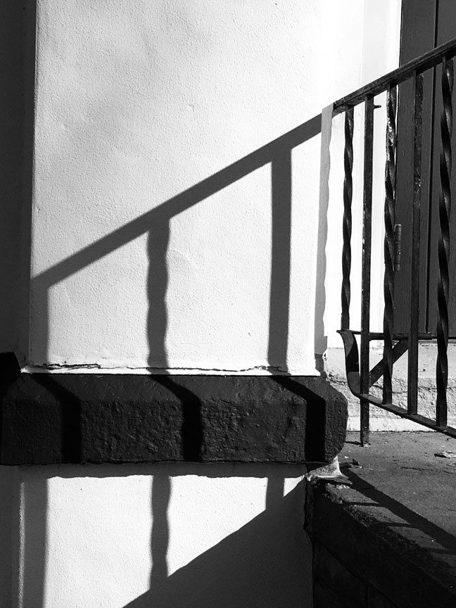
I went. The sun was in a good position and I got some nice shots of the light illuminating some of the gravestones in the cemetery. But the real moment of inspiration came when I went around to the front of the church and something said, “Switch to B&W.” No dialogue this time—I did as I was told. My iPhone has a “Noir” setting that I’ve used before with dramatic results, and the stark contrast caused by the sunlight inspired me to make compositions I’d never have thought of if shooting in color or in more conventional light. Here are a few of those:
As a dear friend of mine likes to say, “Trust your intuition; it’s why God gave it to you.”
And my photographs that are on display in the Emerge Gallery’s Fotographia exhibition? I’ll tell you about them in the next post, but meanwhile, please do visit the show at Artsy https://www.artsy.net/emerge-gallery-ny and enjoy everyone’s amazing work.
I love George Gershwin’s Rhapsody in Blue. And contemporary composer Michael Torke’s Bright Blue Music. And blue skies and blue water. When Robert Langdon of the Emerge Gallery in Saugerties issued a Call for Art for a show he was titling “Something Blue,” I did one of my “digital rummaging” exercises through my recent (two or three years) photographs for some works to submit.
It wasn’t as easy as I thought. Images for gallery shows have to be topnotch in their own right, and they have to have sales potential for the particular gallery you’re submitting to. Here I am submitting to a gallery in the Hudson Valley and most of my best “blue” pictures – again, think water and/or sky – are, well, taken in Rhode Island.
Fortunately, water and sky have a universal appeal that transcends their particular location. It’s not as if I were submitting pictures of buildings in Providence (I hardly have any). So I chose three, and these two were accepted.
Blue Paradise
One of my dear longtime mentors, California-based photographer Kerry Drager, always advises his students and followers that when they’re searching for a composition and find a nice horizontal, then turn the camera around and see if there’s also a good vertical to be had. (And vice versa.) The aptly named Blue Paradise (I love this place) is one of those experiments that didn’t quite work out. With tons of horizontal images in varying compositions already in my files, I wanted to try for a vertical, and the sky that evening seemed as if it would be perfect for this – nice layers of different colors. The problem was that I underestimated the strength of the top, white layer; it was overpowering. It had to go. The end result was what you see here – another horizontal, but one of my best of this scene. And I always like trying for an effect where the solid, unmoving rocks contrast with the silky texture of the water (longish exposure, facilitated by the diminishing daylight). Blue Paradise is hanging, matted and framed, in the Emerge Gallery’s “Something Blue” show.
Unconquered
Unconquered is one of those pictures that virtually took itself. When the wind gods favor me with the wild waves, I find a good composition and click the shutter again and again, because that’s the way you ensure you’ll get one good one out of the bunch. Ask Kerry, he does this on the West Coast. Here my unmoving, solid point was the lighthouse, which (thanks to the telephoto zoom) looks much closer than it is. In postprocessing I had to do some work with clarity and brightness to ensure that the light and the rocks would stand out. And then I wanted to give the picture a title that would draw attention to the lighthouse and not to the obvious drama in the waves. My friend and fellow Catskills photographer John O’Grady often likes to do that – title a photograph after a very small object in the image – and sometimes I find myself channeling John when I’m photographing. What to call a picture about a lighthouse sturdily surviving being battered and buffeted by the wild winds? As I was thinking about this, I had the radio tuned to our classical music radio station, WMHT, and the music being played was my favorite piece by the above-mentioned Michael Torke: Unconquered. I had my title.
“Something Blue” runs in the actual gallery until April 25, but the pictures will still be available to purchase online from Emerge’s Artsy site after that – my Unconquered and lots of other fabulous works by my fellow artists are in the “online only” show. Please, if you’re local, visit the gallery, otherwise welcome online!
As per my usual Friday evening routine, I was listening to the Albany Symphony Hour on WMHT-FM when a composition by 20th-century American composer Virgil Thomson was announced, a ballet titled Filling Station, conducted by the Albany SO’s energetic Music Director, David Alan Miller. Seriously, it really is about attendants at a gas station. When WMHT’s inimitable program host Rob Brown read a description of it as a comic classic that draws us back to pre–World War II America, “when the virtues of the frank and honest workmen were the virtues of the country,” the work of the great photographer Walker Evans came to mind as a visual (if considerably more serious) counterpart. It’s probably no coincidence that Evans embarked upon his joint project with James Agee for Fortune magazine, which resulted in the ground-breaking book Let Us Now Praise Famous Men, the year before Thomson composed his ballet (1936 and 1937 respectively; something must have been in the air).
Several years ago, my son Anton and I went to see a major exhibit of Evans’s work in New York City. It was a great revelation for two photographers, steeped in breath-taking landscapes and Fuji Velvia film, to see this frank documentation of sheer ordinariness, and in black and white. Anton commented, “Could you imagine anyone today photographing a Stewart’s Shop?”
That remark set me on a years-long quest to photograph a Stewart’s Shop. For those of you who aren’t familiar with upstate New York or nearby parts of New England, Stewart’s is a chain of convenience stores, mostly with gas stations, where you can also sit in the booths and eat your breakfast or lunch and read about local events on the bulletin boards. Sort of like 7-Eleven, Cumberland Farms, or WaWa. In other words, the quintessence of the ordinary, the functional, the everyday.
This wasn’t about getting a snapshot but about making a well-composed, well-exposed photograph. A work of art. I tried many times in many places but was never satisfied with the results—until a few months ago, when a brand new, well-positioned, photogenic Stewart’s Shop opened in Catskill, NY, on a corner I drive past quite frequently. I stopped in for lunch (I love their hot dogs), and when I left, out came my iPhone. Success! I processed one of the photos after one of the styles typical for me at this stage, applying a painterly, somewhat gritty look (above); and I processed another (below)—I chose the one that didn’t scream “Taken on New Year’s Day 2021!” too loudly—in ordinary B&W, in homage to Walker Evans, perhaps the most extraordinary photographer of the ordinary there has ever been.