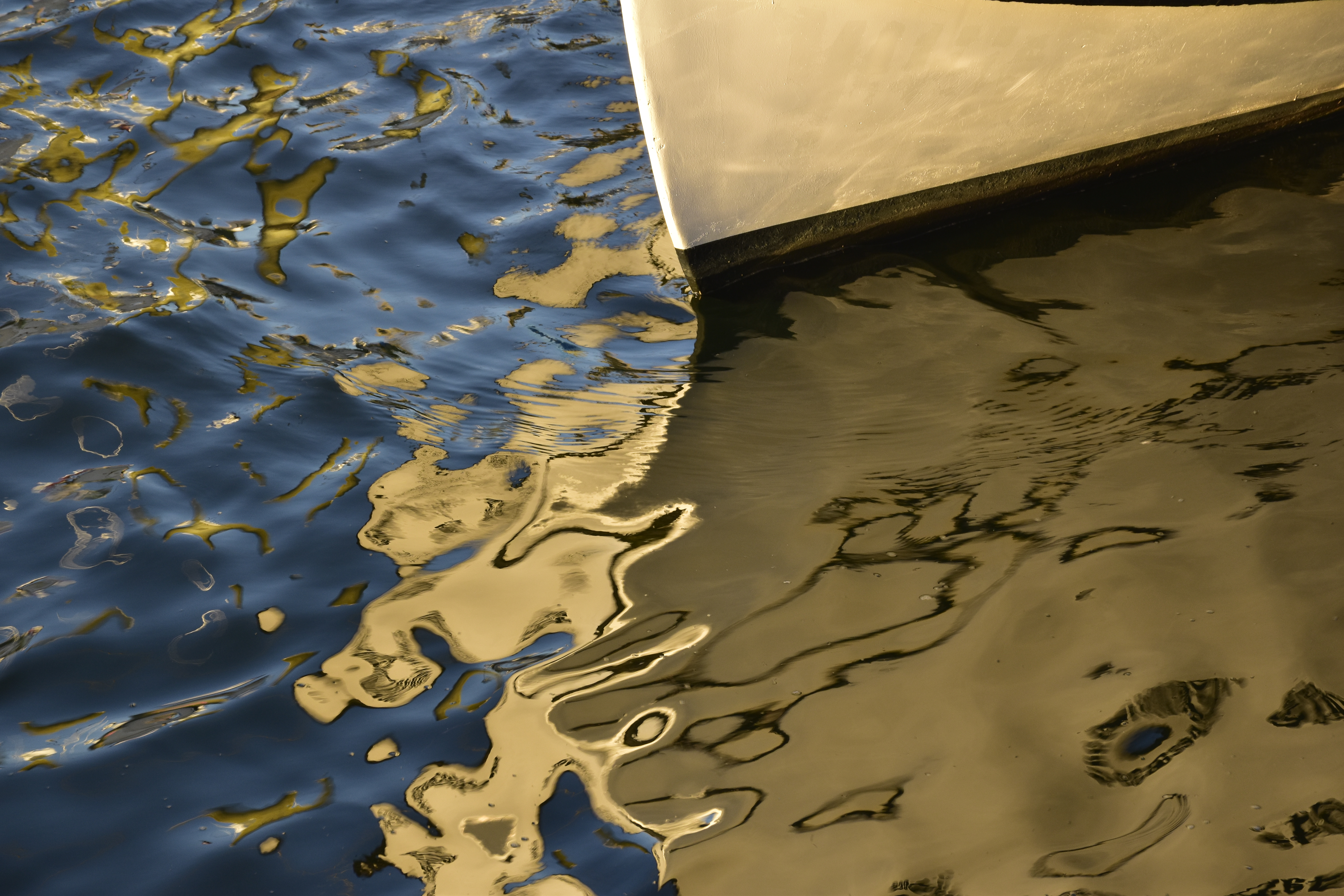
Let me start by attempting a definition of abstract photography that works for me—that is, it’s related to my personal experience of attempting to create “abstract” images: photography in which the design is more obvious, or more important, than the identity of the object being photographed. The image could, for example, be composed in such a way that only the design is obvious, i.e., it’s just about impossible (or, at any rate, pointless for the purpose of appreciating the work) to tell what the object actually is. Or it could be an image in which the object is fairly obvious yet completely unimportant to the appreciation of the work. For me an example of the latter would be patterns in water made by the interaction of colors from a boat, the shape of which will be determined by the movement of the water. Such pictures may contain a small portion of the boat for scale or anchoring, but in the overall context this is minor compared to the design created by the colors in the water.
I don’t normally work with abstract images, but occasionally I get obsessed with a particular approach to it, due possibly to proximity to objects that yield abstract patterns, or to a desire to break temporarily out of my usual way of creating, to escape from a rut, etc. That was my motive recently for taking Kerry Drager’s online course in close-up photography. Kerry is a mentor and friend and is an outstanding teacher and creator of this kind of approach. The course worked for me because during my current obsession with close-ups, much of what I learned from him came to the fore.
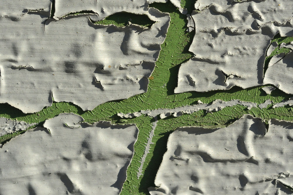
I liked Kerry’s idea of finding “the picture within the picture.” Even in abstract work, you need a composition that makes sense: it’s not just a matter of “point and shoot.” I’ve always loved looking at maps, and sometimes when faced with a pattern out of which I want to get an image that makes sense, I’ll think of the challenge in terms of creating a map. Photo 1 (which is one I made for Kerry’s course) is a tiny section of an already small image of peeling paint, and I selected the green cross shape to resemble a crossroads within a 3-D map.

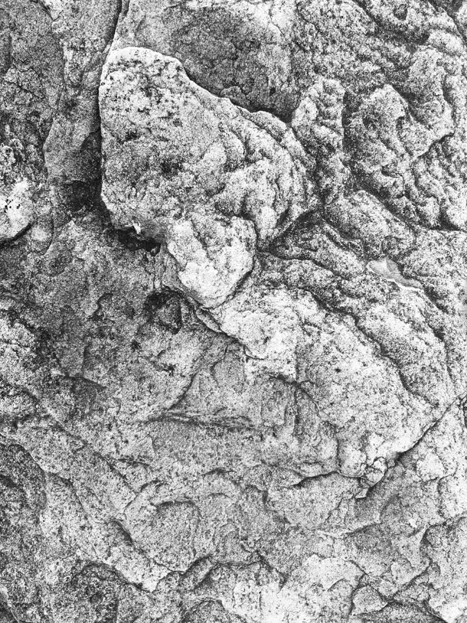
Rocks and trees, along with water, are two of my favorite photographic subjects. When I discovered the rock in Photos 2 and 3 on a recent stroll through the local park, I first attempted to photograph it as a rock but then realized that the very top of it had some interesting patterns that, if photographed creatively, could look like a sort of topographical map of mountains without it being obvious that the object photographed is a rock. Photo 2 is one result, and Photo 3 is what resulted when I moved in closer. (Both of these photos were taken with my iPhone using the Noir filter. If I want to make instant B&W pictures, I find that Noir tends to give me the results I’m looking for.)

Perhaps you’d have immediately guessed that Photos 2 and 3 were of rocks; perhaps not. (Some viewers might well have thought these were pencil drawings rather than photographs.) It’s more difficult, however, to “disguise” trees in making an abstract. Even though, in a good photograph, the design will predominate, the viewer will still recognize that the object is a tree. Today, however, studying the trees outside my building, I hit upon an idea: turning the camera (the iPhone again) at a slight diagonal. This introduces the challenge of making sure you have only the tree in the frame, nothing extraneous. And while it’s never going to “disguise” the tree, the resulting image (again, as always, if well composed), will have a more “artistic” look to it. This is what I hope I achieved in Photo 4.

Leave a comment