
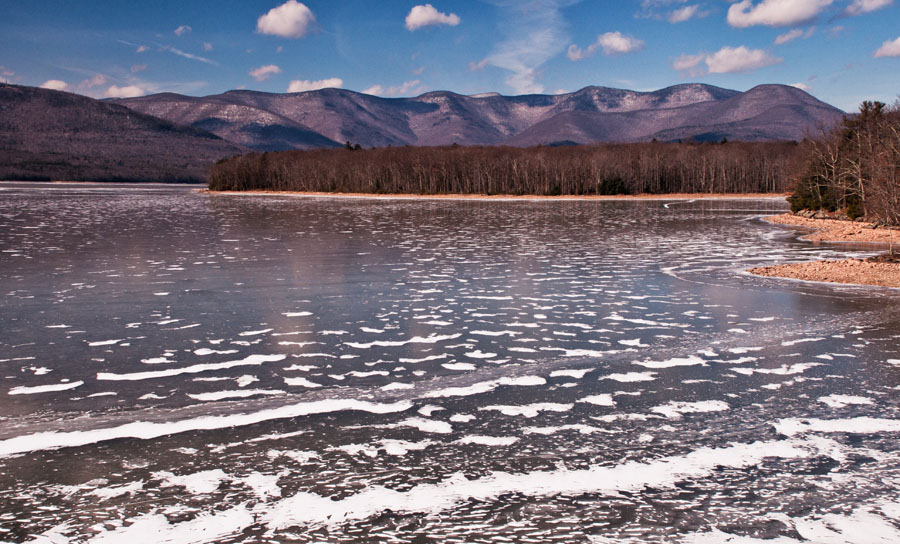
I love shooting at the Ashokan Reservoir, that once-controversial body of water in New York State’s Catskill Region whose creation necessitated the obliteration of several villages in the Esopus Valley in order to supply water to New York City. The above image, made yesterday in bone-chilling temperatures, is arguably the finest in my Ashokan Reservoir collection. This version of the picture is the original postprocessed version, done first in Raw and then in Photoshop CS5 using a few adjustment layers.

Then, just out of curiosity, I brought the photo into Nik Color Efex Pro 4 and used the Tonal Contrast preset, which gives values of 25% (Highlights), 50% (Midtones), 25% (Shadows), and 20% (Saturation). To my eye the result–here it is above–seemed a bit of overkill, but I saved it along with the original. Then–and here is always the insidious trap with these plug-ins–the more I looked at the two versions, the more “normal” the Nik version looked, and the more “boring” the original. Not a good thing–to me it issues a powerful warning about the potential for plug-ins and filters (or at least, I should clarify, their overuse, especially in nature images) to influence what the eye will accept.
I decided to experiment with creating a third version. This is, let me emphasize, not so much a compromise as an alternative interpretation. Again it uses Tonal Contrast in Nik Color Efex Pro 4, but here I’ve changed the values to 20%, 25%, 20%, and 20%. Here it is above.

Then came the inevitable step: a black-and-white conversion. Again, an alternative interpretation, not something to replace the color versions. I first tried it with a B&W Adjustment Layer in Photoshop but didn’t particularly care for any of the results I was getting, so I went with–guess what–the B&W preset in Nik Color Efex Pro 4. Why? Because it’s a nature/landscape image, and I’m perhaps a bit wary of falling into an overly “artsy” interpretation were I to use Nik Silver Efex Pro 2, which I especially like for my old and historic buildings. Here I used 60% (Filter Color) 34 (Strength), 8 (Brightness), and 44 (Contrast), as well as 31 and 20 for the Shadows and Highlights sliders respectively. Here you see the results.
Now comes your opportunity to win a free matted print of one of these images. Just reply in a comment to this post and tell me (1) which of the three color images you prefer; and (2) whether you prefer the color or the black-and-white. There are no “right” or “wrong” answers–just call it a marketing survey. Please identify your preference by the number given in the caption — Photo 1, Photo 2, Photo 3 — to avoid any misunderstandings. From the replies received by February 17, 2013 to both questions I will randomly choose two persons to receive a 5 x 7 print, matted to 8 x 10 and signed by me. Each winner will receive the version he or she preferred.
All images are printed on high-quality professional Lustre paper, carefully matted and inserted into a protective sleeve before being carefully packed and shipped. I will notify the winners by email to request their mailing address.
Thank you for participating in my marketing survey! — Oh! At the top of the blog I described the Ashokan Reservoir as “once controversial.” You can well imagine that the destruction and flooding of such a large portion of the Esopus Valley evoked strong feelings, heartache, not to mention the loss of many homes and livelihoods. Then I recently watched an excellent DVD by renowned historian/film maker Tobe Carey on the construction of the Ashokan Reservoir, which eloquently depicted the effects this project had on the lives of those who were displaced by it. Near the end of the film, a man was interviewed who observed that if the reservoir had not been built here, this area would undoubtedly have been subjected to massive development. “What would you rather be looking at,” he asked, “this beautiful reservoir or a shopping mall?”
To this observer, anyway, that’s a no-brainer.

Leave a comment