A few weeks ago I visited an antiques store in the Catskills region known as the Mountain Top. The store, at the junction of Routes 23A and 296 in Hunter, New York, is run by Cindy Smith, and contains both “Old Treasured Belongings” — the gently used items of all kinds — and “Handmade by Cindy” — a stunning array of handbags and other products made by Cindy herself. If you want to read more details, and to see my full-color versions of the photos below, please check the December 5 post on my Hudson Valley and Catskills blog.
But in this post I want to show you just a small part of the capabilities of Topaz’s B & W Effects. This is a powerful tool for expanding your creative postprocessing options, and given my propensity for photographing historic and other interesting buildings, both inside and out, I purchased and downloaded it to see how it could enhance what I call my “Modern Vintage” work.
Since my objective is that you enjoy the old-fashioned warmth and coziness of Cindy’s store as mediated by my interpretations, rather than to give you a detailed photo tutorial, I’m going to post the four pictures with just a brief word of explanation about how Topaz B&W Effects was applied in each image.
 The presets in Topaz B&W Effects are grouped into collections with such headings as Traditional, Albumen, Cyanotype, Stylized, Opalotype, and others. Each collection then has a number of different presets, which you can preview in a grid if you want and then select from the grid the one you want to work with. This photo was processed using Warm Tone White with Border from the Traditional collection. I increased the Brightness slightly to give it a hint of a faded look.
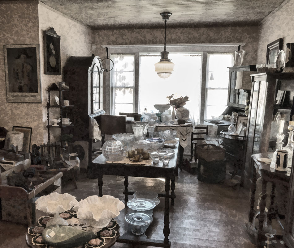
I’m not a fan of unusual effects for their own sake, but in this case it seemed to 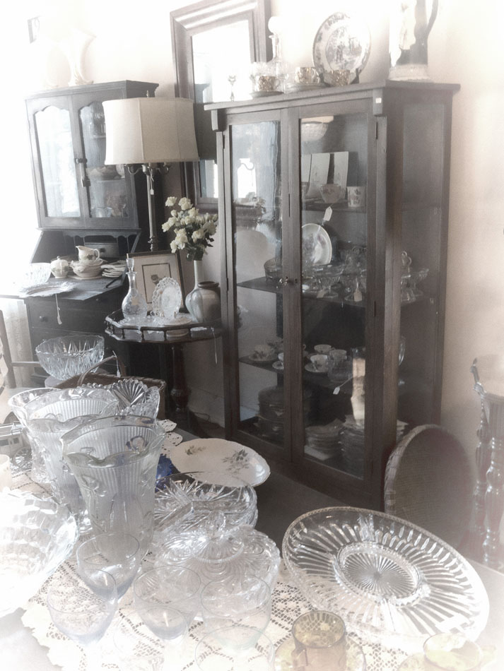 fit the subject of the image, as if the room were emerging like a benign spirit from a pleasant past. (No, no, I’m not channeling Dickens — at least, I don’t think so!) It’s the Milky White preset from the Opalotype collection. I’ve found that Opalotype presets have good potential for these “old-fashioned” interpretations; I’ve used another in a slightly different context, the interior of a rural diner.
 Both in Topaz B&W Effects and in Topaz Adjust 5 I’ve found the Stylized collections to be great places to mine for processing ideas, and so the next two images were both processed with Stylized presets. This one used the Painterly Color preset; it seemed to be a good way both to make sense of the busyness of the room and to contrast with my interpretation of the first photo above that has similar content.
A word of warning: Topaz B&W Effects is like rich food; you can only eat so  much rich food at one sitting, and in my experience I found myself saying “enough!” by the time I got to the fourth picture, again in one sitting. A lot of trial-and-error went on here as I found it difficult to settle on an interpretation I could live with. My aim, after all, was to make workable, artistic interpretations in their own right rather than to offer demonstrations of Topaz B&W Effects as ends in themselves. For this last one I again chose from the Stylized collection, this time the Detailed Grunge preset. I gave it a very slight tint. Looking back on the entire process, I found it interesting that my “Modern Vintage” interpretations lend themselves to the two extremes, either a grungy, detailed, structured look or a soft look with vignetting or other “fading” effects toward the edges.
There you have it — my brief intro to Topaz B&W Effects. If you visit their website you can download a free trial before deciding to buy. I get no commission here, just wanted to share my enthusiasm for this great plug-in in case it helps you. The photos are for sale on my website.

Leave a comment