Another Reason I’m Glad I Brought My Camera

img_0697-ed-s

As a historian and a photographer I like to photograph historic sites, broadly defined. So when I discovered that the opening of a photography exhibit to which I was invited was being held in an old, restored mill in Kingston, New York, I slung my Canon G9X around my neck on the way out the door, figuring that at least I might get an interesting shot of the building’s exterior.

Kingston, in the mid Hudson Valley, is rapidly garnering a reputation as a major artistic center. Artists are flocking there to live and to work. In 2013 an organization called the Rural Ulster Preservation Company (RUPCO) purchased a now abandoned historic building (built 1903) that originally housed the  United States Lace Curtain Mill  and transformed it into a center with apartments and studio space for artists as well as, on the ground floor, space for exhibitions.

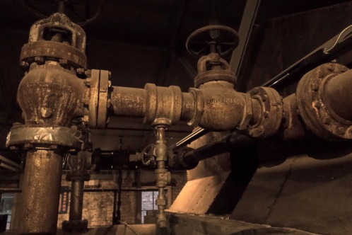
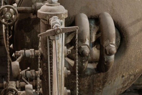
As expected, the exterior was worth photographing, and I lined everything up and got the image I wanted before going inside to see the exhibition I had come for. A friend I was with drew my attention to a little corridor and suggested I might find it interesting. Anticipating  more artwork, I was instead surprised to note that some of the machinery that had once been used to operate the mill was still there, in its original place.  Another reason I’m glad I brought my camera! Who could resist that? And I was in good company.

Here are some of the photographs I took along with descriptions of how I processed them. First, the one at the top of the page: This is the only interior shot that I took with the camera’s straightforward settings (as opposed to artistic or “scenic” presets). The very low light level required an ISO of 1600, so the first thing I did was to get rid of the noise using Nik Dfine. I then took the image into Nik Viveza, which I always find is a powerful tool for making selective adjustments accurately and fairly quickly. Since the color came out too warm I decreased the saturation to -35, and in order to maintain definition I upped the contrast to 10 (always remembering Rick Sammon’s dictum “Shadows are your friends”) and gave the structure an ever so slight bump to 2.

img_0696-viv-s


Those of you who know my work are probably wondering why I didn’t go for one of my “modern vintage” looks in the photo of the building’s exterior, possibly sepia or B&W. I tried it many different ways but didn’t like the results. The brickwork made for too much detail, and thus a monochrome looked confusing. You’ll notice the image is virtually square; because of the time of day, the setting sun threw the side of the building into bright, warm sunlight and the front into shadow. Regardless of what I tried, the only solution was to crop most of the building’s side out of the photo. (Reminder to self: Return with camera on an overcast day. That way the front and the side will better integrate with each other.)
img_0699-ed-s

The other machinery photos were all taken with the camera’s “Nostalgic” scenic preset. This obviated the need for a high and noisy ISO, but it did result in a somewhat soft, well, nostalgic look. In the one above the processing was simple: In Lightroom, again wanting increased definition, I bumped the contrast up to 24 and the clarity to 21. Then I took the saturation down to -17 for a look approaching monochrome but not quite getting there. In Photoshop I used Viveza to increase the structure on the little horizontal bar that has a chain on each end.

img_0702-ed-s

Finally, attracted by the pattern cast by the shadow, I made an abstract (above).  Wanting increased definition, in Lightroom I bumped the contrast up to 21, darkened the shadows to -38, and slid the clarity up to 19. In Photoshop I used Viveza to decrease the saturation and to increase the structure on the main object in the picture (sorry — I’m a photographer not an engineer, so I have no idea what any of these things are called except “thingamajig”).

That was an interesting day out. Thanks to the friends who invited me to the show, and to RUPCO for breathing new life into a century-old building in midtown Kingston.

Digital Neutral Density

DSC3155 s

On the morning after Christmas my son, Anton, and I went out to shoot at Cooper Lake. One advantage to having a great place like this nearby is that you become familiar with the optimum times to be there and the optimum angles from which to shoot, depending on when you know the good light will be hitting a specific place. Since the path bordering Cooper Lake curves around, you can start at one spot for first light and then make your way to the next spot when the sun is slightly higher. (A lake surrounded by mountains has its own challenges when it comes to allowing for differences from the official sunrise and sunset times.) And while you’re waiting for the light to be in the right position, there’s always the beaver pond, or close-ups on the opposite side of the path.

On this particular morning one of my “while you’re waiting” shots was a capture of Anton in action. Instead of shooting from the edge of the path, he had got right down to the edge of the shore. I decided to go for an environmental shot, i.e., one that shows him in the broader landscape instead of a tight shot. (This is beautiful Cooper Lake, after all.)

The problem with the resulting image was that the lower half was too dark while the upper half verged on the too light side — perfect conditions for a graduated neutral density filter. But I don’t have one in my collection, or at least it wasn’t with me that day.  I remembered that Nik Color Efex Pro 4 has a grad NDF preset, so I pulled the image into Photoshop and then into Color Efex Pro. Easy! You can manipulate sliders to change the lightness/darkness of the two halves of the photo and to regulate the degree of blend. If your exposure problem affects the right and left halves of the image rather than the upper and lower halves, there’s a rotating slider as well.

Lightroom has an adjustment brush tool for this situation, but personally I found the Nik preset much easier (and faster) to use. Just a personal preference.

The processed image is at the top of this post.

While you’re at it, you might want to take a look at Anton’s website.

Black and White Photo Challenge

Fellow photoblogger Janice Sullivan nominated me for the 5-day Black and White Photo Challenge. It had been a while since I’d done any serious B&W conversions so I was glad to have this discipline. Below are the photos, with something about each one. Each image was originally posted on my Facebook page.

Ed IMG_1190 Nik Neutral sThis is the interior of The Coffee Pot in Littleton, NH; the old-fashioned interior lends itself well to B&W. I had already processed this in color and chose to make the B&W conversion from the psd file instead of from the jpg to which I had added some Topaz Adjust finishing touches. This conversion was made with Nik Silver Efex Pro 2, in which I used the Neutral preset and simply increased the structure a bit as I like the somewhat gritty look that gives.
OLYMPUS DIGITAL CAMERAIf you know my image Dreamtime at the Ashokan Reservoir, this is another taken on the same day. After preliminary processing in Lightroom 5, I brought it into Photoshop and added a B&W layer, decreased the Cyans and Blues to darken the clouds (and their reflections in the water), and increased the Yellows and Greens to lighten the bridge structure to make it more prominent. I also cropped it a bit from the bottom; without the “dreamy” look of the color image I wanted the bridge to stand out more.


DSC-3000 BW s

This was taken at the Sachuest National Wildlife Refuge, Middletown, RI, when sun and wind combined for the right conditions early one morning. Observing the waves and trying to capture “the decisive moment” is a meditative experience. Here I was struck not only by the wave action but also by the play of the rising sun on the edges of the rocks. B&W conversion was simply a B&W layer in Photoshop CS5. I darkened the Cyans and Blues at the top of the image to make the contrast with the wave stand out more.


DSC-0338 BW s

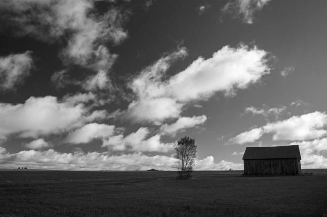
This image of a barn and tree in the Adirondacks first went into Lightroom to increase clarity to enhance detail in the barn and the grass. Then I brought it into Photoshop for B&W conversion by adding a B&W layer. I tweaked the Blues to darken the sky but not too dark, then increased the Greens to bring out more detail in the grass.


DSC 2 -2619 BW s

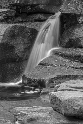
Finally, here is the Diana’s Bath waterfall in New Hampshire. I began by working on my processed jpg, but then decided to take the psd file back into Lightroom to increase the Clarity. That worked! Then back into Photoshop where I added a B&W layer, then tweaked the Shadows/Highlights a bit. In the process, I ended up with a better color version as well.

What do you think? Let me hear from you. If you’re interested in purchasing a print as a gift for yourself or a friend, click on the photo to go through to my FAA website. Thank you for looking.

Ashokan Deep Winter: Win a free print!

Photo 1

Photo 1

I love shooting at the Ashokan Reservoir, that once-controversial body of water in New York State’s Catskill Region whose creation necessitated the obliteration of several villages in the Esopus Valley in order to supply water to New York City. The above image, made yesterday in bone-chilling temperatures, is arguably the finest in my Ashokan Reservoir collection. This version of the picture is the original postprocessed version, done first in Raw and then in Photoshop CS5 using a few adjustment layers.

Photo 2

Photo 2

Then, just out of curiosity, I brought the photo into Nik Color Efex Pro 4 and used the Tonal Contrast preset, which gives values of  25% (Highlights), 50% (Midtones), 25% (Shadows), and 20% (Saturation).  To my eye the result–here it is above–seemed a bit of overkill, but I saved it along with the original.  Then–and here is always the insidious trap with these plug-ins–the more I looked at the two versions, the more “normal” the Nik version looked, and the more “boring” the original. Not a good thing–to me it issues a powerful warning about the potential for plug-ins and filters (or at least, I should clarify, their overuse, especially in nature images) to influence what the eye will accept.

Photo 3

Photo 3

I decided to experiment with creating a third version. This is, let me emphasize, not so much a compromise as an alternative interpretation. Again it uses Tonal Contrast in Nik Color Efex Pro 4, but here I’ve changed the values to 20%, 25%, 20%, and 20%. Here it is above.

DSC0229 BW Bl

Then came the inevitable step: a black-and-white conversion. Again, an alternative interpretation, not something to replace the color versions. I first tried it with a B&W Adjustment Layer in Photoshop but didn’t particularly care for any of the results I was getting, so I went with–guess what–the B&W preset in Nik Color Efex Pro 4. Why? Because it’s a nature/landscape image, and I’m perhaps a bit wary of falling into an overly “artsy” interpretation were I to use Nik Silver Efex Pro 2, which I especially like for my old and historic buildings. Here I used 60% (Filter Color) 34 (Strength), 8 (Brightness), and 44 (Contrast), as well as 31 and 20 for the Shadows and Highlights sliders respectively. Here you see the results.

Now comes your opportunity to win a free matted print of one of these images. Just reply in a comment to this post and tell me (1) which of the three color images you prefer; and (2) whether you prefer the color or the black-and-white.  There are no “right” or “wrong” answers–just call it a marketing survey. Please identify your preference by the number given in the caption — Photo 1, Photo 2, Photo 3 — to avoid any misunderstandings. From the replies received by February 17, 2013 to both questions I will randomly choose two persons to receive a 5 x 7 print, matted to 8 x 10 and signed by me. Each winner will receive the version he or she preferred.

All images are printed on high-quality professional Lustre paper, carefully matted and inserted into a protective sleeve before being carefully packed and shipped. I will notify the winners by email to request their mailing address.

Thank you for participating in my marketing survey! — Oh! At the top of the blog I described the Ashokan Reservoir as “once controversial.” You can well imagine that the destruction and flooding of such a large portion of the Esopus Valley evoked strong feelings, heartache, not to mention the loss of many homes and livelihoods. Then I recently watched an excellent DVD by renowned historian/film maker Tobe Carey on the construction of the Ashokan Reservoir, which eloquently depicted the effects this project had on the lives of those who were displaced by it. Near the end of the film, a man was interviewed who observed that if the reservoir had not been built here, this area would undoubtedly have been subjected to massive development. “What would you rather be looking at,” he asked, “this beautiful reservoir or a shopping mall?”

To this observer, anyway, that’s a no-brainer.

Leaving Well Enough Alone in Photography

DSC0670 blog

Sometimes the problem with having an array of editing software and plug-ins on one’s computer is that one can fall into the trap of thinking that one has to use it. Don’t get me wrong–I love my Photoshop, Nik software, Topaz Adjust and all, but the danger of overprocessing is always present; these toys are always screaming out to be used!

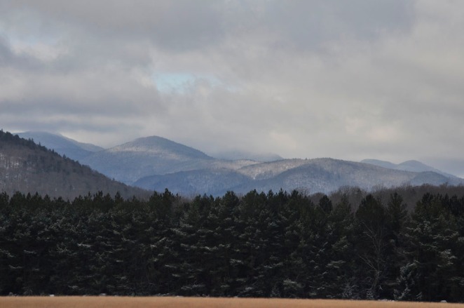
Here are two photos I made on my latest visit to the Adirondacks, just after Thanksgiving. It’s of the High Peaks from one of my favorite vantage points, where the Adirondak Loj Road intersects with Route 73. I always shoot in Raw and jpg, and when I uploaded and looked at these particular images in jpg, I loved them just as they came “out of the box.” OK, possibly I cropped the bottoms slightly, but otherwise my first reaction was that they looked just as Asher B. Durand would have painted the scene.

I opened the Raw file of one of the images to try to process it but gave it up as unnecessary–why “improve” on what I already liked as it was? Am I concerned that people won’t think me sufficiently “professional” if I can’t offer an impressive description of my postprocessing?

Interestingly, I included one of these images on one of my 2013 calendars with the theme A Certain Beauty (thank you to the friend who suggested this theme), and when a lady who had bought one of the calendars leafed through it and came to this picture, she commented, “It looks just like an oil painting.”

DSC0679 blog

Some Quick B&W Conversions

Cardinal Timothy Dolan is coming to St. Anastasia’s parish in Orange County, NY to celebrate the centennial of our parish cemetery, and I’ve been asked to provide photos of the cemetery for use in the Commemorative Book and to photograph the event itself. In return for my services, the Centennial committee has kindly given me a free full-page ad in the Commemorative Book; I just had to supply the ad copy.

I selected five representative photos, added the text, and arranged it all into what I think is a really attractive design; hopefully the printer can tweak it a bit.

Then I realized that the ad would be printed in black-and-white, not in stunning color. And I thought, I want it to be my black-and-white, not the printing firm’s default B&W. Back to Photoshop. I made my own B&W versions of each photo and reassembled the ad. Here below are three of the five images and how I did quick (very quick — they needed them urgently) conversions of each.

For this autumn image of Cooper Lake I used the Neutral preset in Nik Silver Efex Pro 2, set the Brightness to 5 and the Contrast to 10 to ensure definition of what otherwise might have appeared as murky shadows.

What to do with a fall foliage image of New Hampshire’s beautiful Shelburne Birches that depends primarily on color for its effect? Relying on the whiteness of the tree trunks for definition, I simply added a B&W adjustment layer in Photoshop and used the “Lighter” preset to ensure some detail in the leaves.

It’s usually somewhat easier to do a B&W conversion of a non-nature image. This one is from my “Stieg Larsson’s Sweden” collection. With more time I would, and probably will, give this one more thought for a more “artistic” rendition, but for now I used the “High Structure (smooth)” preset in Nik Silver Efex, left the other values at 0 but set the Structure at 20.

Not leaving anything to chance, I provided a print-out along with the images on a disk. At first I set the printing option to “Use black cartridge only,” but this really muddied up the blacks, especially in the Cooper Lake image, so then I tried leaving it at the “High quality” default under the Color tab in the printing dialogue and this worked.

A Photogenic Diner

Diners are fun to photograph. I mean the ones with real local character, not those that tend all to look as if cut from the current trendy cloth for diner looks.

I had my eye on Selena’s Diner in the Catskill village of Haines Falls, New York for a while, and a few weeks ago, after leaving a reception for the Twilight Park Artists Show, where I had pictures on exhibit, I pulled in there quite on impulse to grab a light bite before the long drive through Kaaterskill Clove and down the Thruway. The timing couldn’t have been better; nor could the place where I chose to sit, because I was at one end of the oblong little building and the early evening sun was forming these long streaks of light that led my eye from my seat into and through the length of the diner. I had my discreet little Canon Powershot S95 with me and got several images. As I left, of course, I photographed the outside as well. Here is a selection of the images and how I processed them.

I began with Raw processing, as always, and here was fairly generous with the Contrast and Clarity sliders because I wanted to accentuate those sunshine-painted patterns.

In Photoshop I continued the processing with Nik Efex Pro’s ProContrast at 40%. I aimed to keep a reasonable unity of processing styles for this little series and was intending to use the Nik Tonal Contrast for them all, but it didn’t work for this one; this image needed a smoother look. Note how I deliberately included the placemat at the bottom of the picture to establish where this was!

Tonal Contrast from Nik Efex Pro brought out the different textures in this picture. I used Highlights 24, Midtones 30, Shadows 60 (excellent for defining the areas that otherwise might literally remain “in the dark,” and Saturation 20.

This one uses Nik Efex Pro’s Tonal Contrast with Highlights at 40, Midtones 50, and Shadow 62. Saturation 20. I never overdue saturation since I rather abhor that exaggerated eye-candy look so beloved of some.

Sunflower Photographs: 2 + 2 = 2

Sunflower season is upon us, that time when fields are filled with endless rows of these dear, stately flowers. After trees, I think that sunflowers are the most anthropomorphic member of the plant kingdom: their bright yellow smiles and their spread-out leaves seem to offer a hearty “Welcome! Look at me!” to all who pass by.

Thanks to a tip-off from fellow photographer G. Steve Jordan of New Paltz (more about Steve in a future blog), I found a huge field of sunflowers on Route 299 leading out of town; they were flanking a big tree that belongs in a painting by 19th-century landscape painter Asher B. Durand. Nice! An “anchor” for my photos. And the eight-feet-tall sunflowers’ welcoming qualities came into play when I hid under them during a sudden rain shower and they protected me from getting soaked!

The sunflowers in the photo I’m going to show you here aren’t from the Hudson Valley, however, but from Connecticut: Buttonwood Farm in Griswold. I’ve been there several times during their annual “Sunflowers for Wishes” week in July, and I believe this photo was from my second visit. The barn wall is from a recent trip to the Delaware Water Gap with fellow members of the Ridgewood Camera Club, and so you’re looking at some artwork combining photos from Connecticut and Pennsylvania and made by a photographer in New York. Who belongs to a New Jersey camera club.

Starting by ensuring that the two photos were the same size and then cloning out the rusty nails in the barn wall photo, I combined the two photos in Photoshop. For the first one I dragged the sunflower photo over the barn wall photo. I wanted that wall to provide texture for the photo. I used the “Darken” blend mode with 100% opacity, then selected the flowers and increased the brightness. There are many different blend modes available, of course, but I preferred “Darken” because it made the end result look as if someone had long ago painted sunflowers on the wall and it was all now peeling. Finally, I applied the Color Contrast preset from Nik Color Efex Pro to make the entire picture a lot brighter.

The second version gives an entirely different result. This time I began by changing the blue sky in the sunflower photo to the rich brown you see here, then I pulled the barn on top of the sunflowers. Here the blending mode was “Color burn” at 56% opacity. It gives a rather dramatic result, I think; at least two friends have commented on the “3D” effect. Regular readers of this blog will know that I love to photograph old buildings, especially old buildings that are sort of hurtling toward a state of ruin. I keep fantasizing that maybe someone will come along and liven up one of those old buildings in Spruceton Valley in the Catsksills by painting sunflowers like this on it. Anyhow, please tell me: Which of these two versions do you prefer, and why? I’d love to hear from you.

“Seen Better Days”: Interpretive Postprocessing of Photos

I was going to call this collection “Dilapidation” until I got a deliciously evocative shot of an alleyway in a rundown town and I didn’t think “dilapidated” really described alleyways. Whereas my historic collection captures the Enduring–buildings such as at New Paltz’s Historic Huguenot Street or in nearby Hurley or the Kingston Stockade District that have been deliberately and lovingly preserved for their aesthetic and historic value–“Seen Better Days” rather preserves the Ephemeral–before the building gets demolished or renovated or succumbs to the ravages of the weather.

My “Seen Better Days” collection lends itself particularly well to black-and-white processing. This can be classic black-and-white, some version of sepia or another “antiquing” sort of look. Some photos can be processed in multiple ways, depending on the interpretation I want to give them. Here I’m going to show you one photo in three different interpretations.

The location of the building is best identified vaguely as “somewhere in the Catskills.” It was for sale and I understand that it has recently been purchased, so obviously I needed to do my work before the new owners do theirs. As I pointed out in my previous blog, if you shoot in color, before you can make a successful monochrome image you have to start with an acceptable color original. The color version here was processed first in Raw and then in Photoshop CS5: some cropping, straightening (it can be difficult to attend to such details during the actual capture when you and your tripod are standing in the middle of a road), enhancing the contrast (and, in Raw, always the clarity), vibrance, and saturation.

I wanted the first monochrome to be a starkly clinical black-and-white image. Starting with the color image here, I processed it with Nik Silver Efex Pro 2, choosing the Fine Art Process preset and increasing the structure to 72. Even though it’s “starkly clinical,” I consider that it nicely straddles the line between Fine Art and Documentary work. (I’d appreciate your comments on this!)

Then I wanted to “reproduce” an old, faded photograph that someone may have kept because they, or their family (parents? grandparents?), lived there a long time ago–during those “better days.” Again using Nik Silver Efex Pro 2, I chose the Antique Plate preset, increased the brightness to 60 and decreased the structure to -4. (I’m obsessed with high structure these days and so it was an exercise in artistic discipline for me to see that I can occasionally live without it and still produce a satisfactory photo!) As a “crossover” I think this interpretation is also a candidate for my Fine Art “Modern Vintage” series.

I’ve sent the photos to some friends and have received different opinions on which ones people liked best. I’d like to hear from you: Which one is your favorite, and why?